"Our primary goal was to craft a visual identity that would adapt to our clients' needs while also conveying the unique personality of our team."
-Andy Urrutia. CEO & Founder
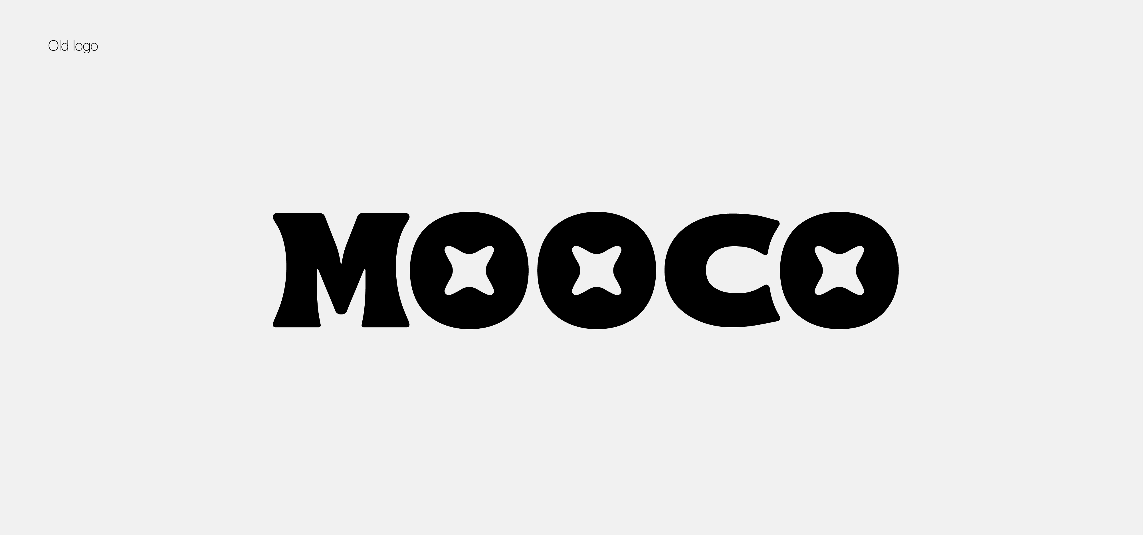
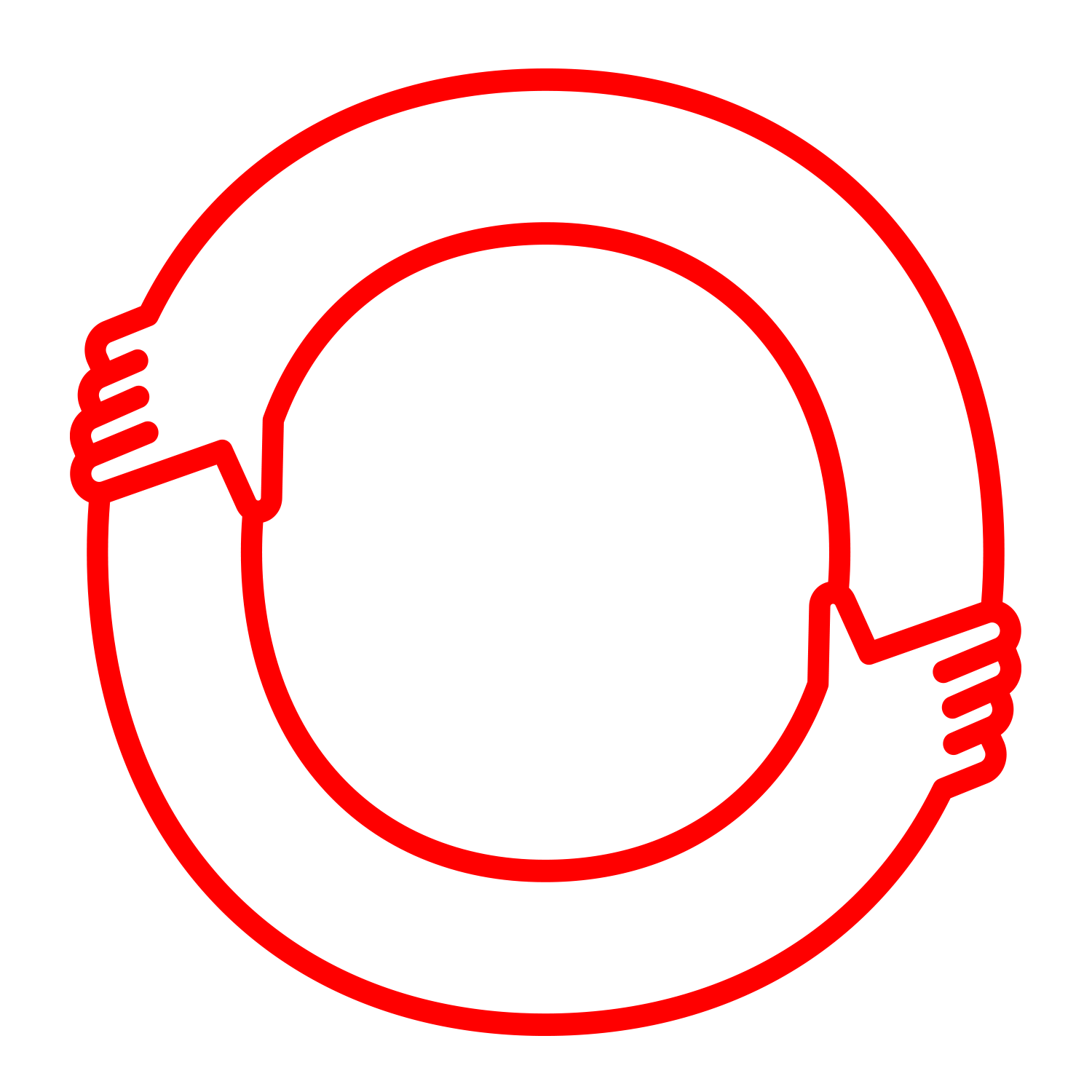
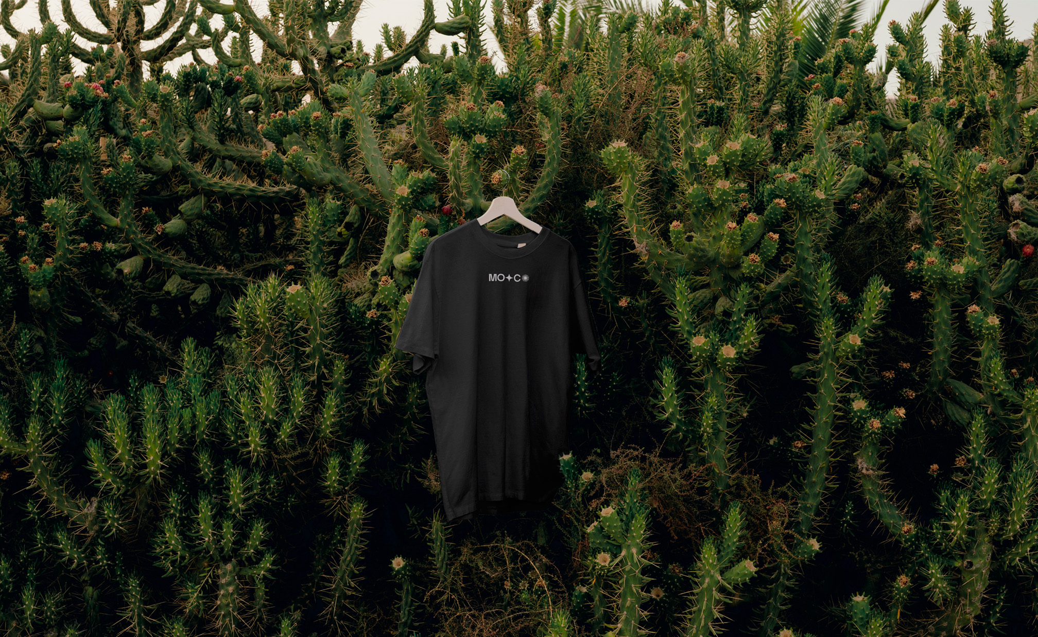
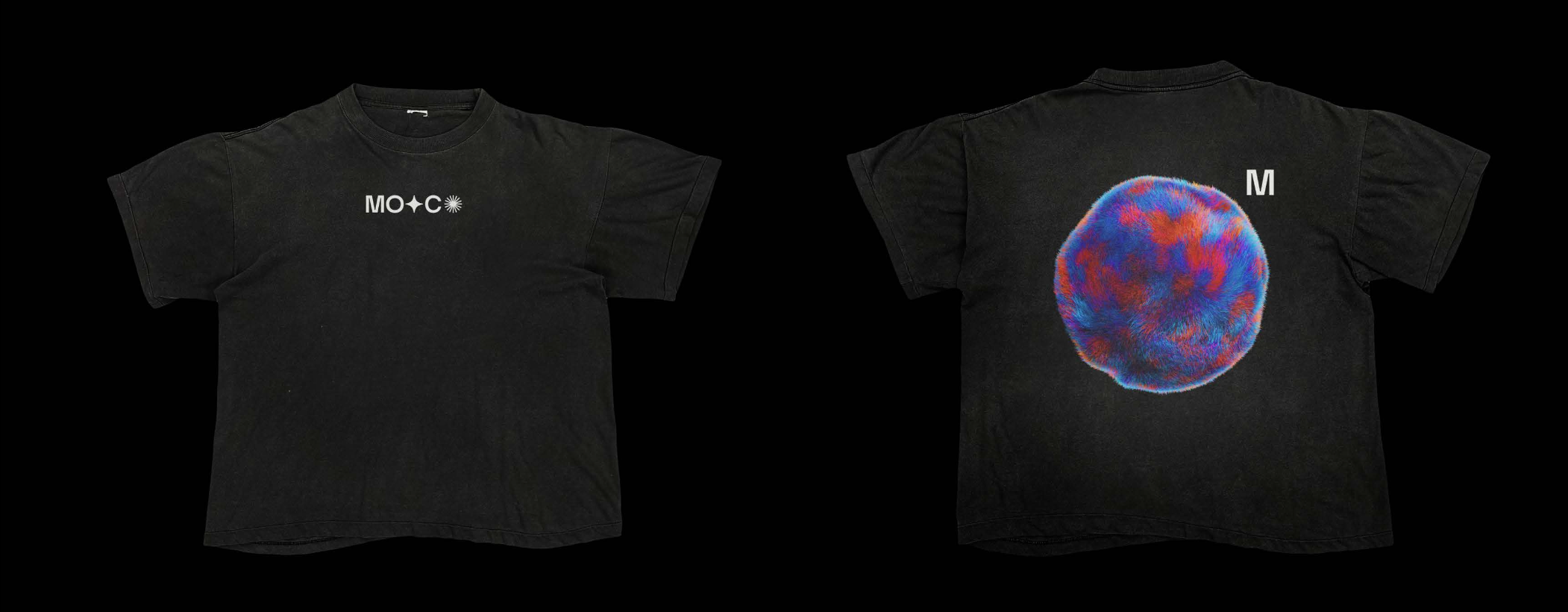
The Logo.
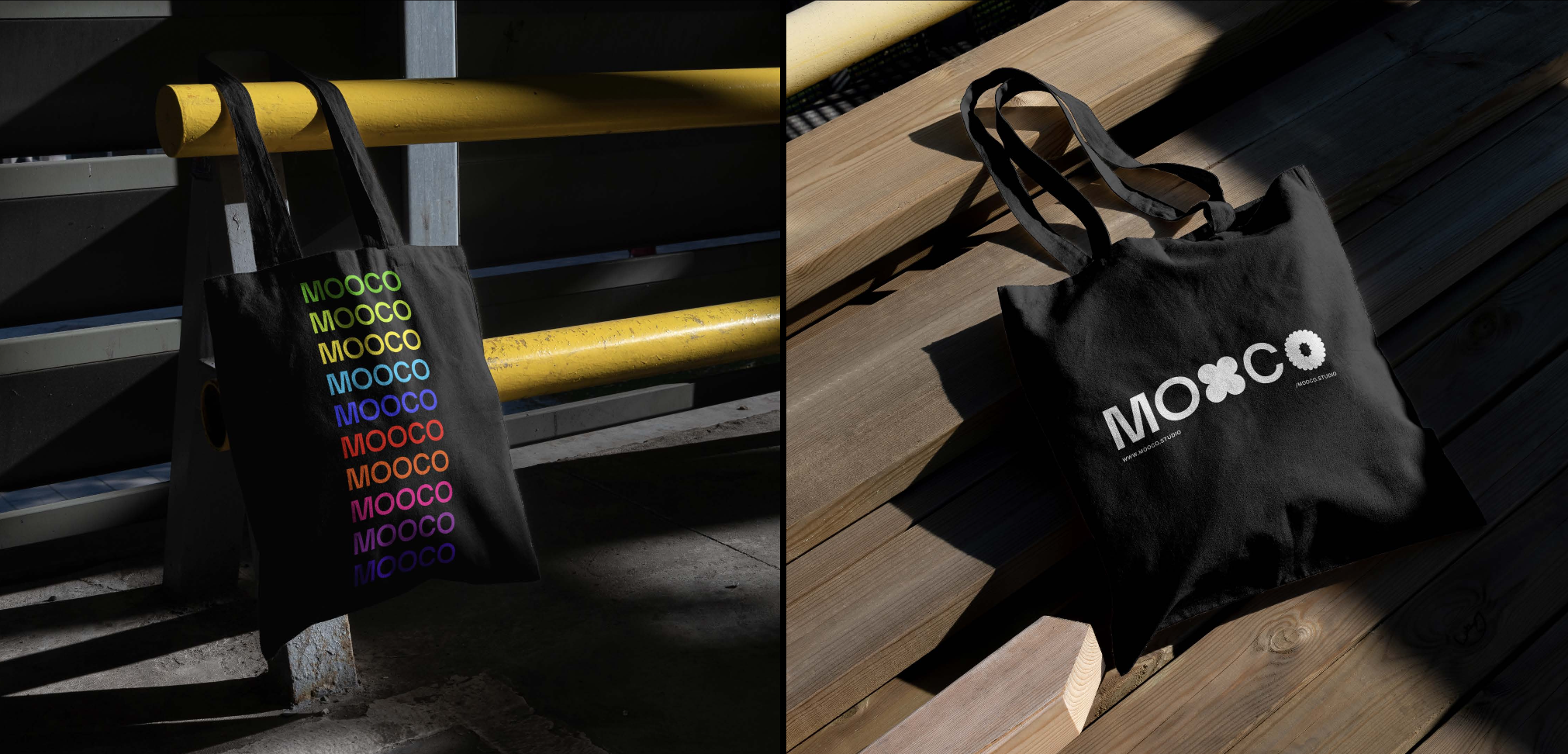
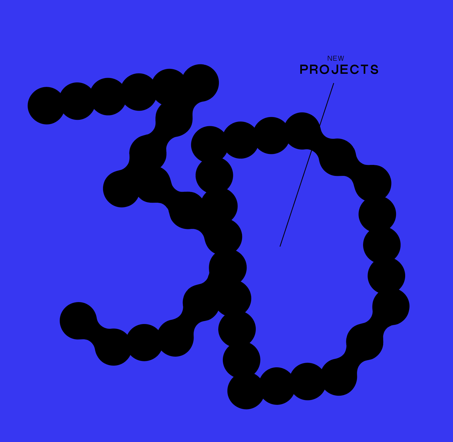
The new MOOCO logo is a dynamic representation of the studio's four main skills: Branding Design, Illustration, 3D, and Motion Graphics. The letter 'O' in MOOCO serves as a canvas for showcasing these pillars, with each 'O' being transformed into a distinct design element tailored to connect with clients' specific project needs.
Iconography.
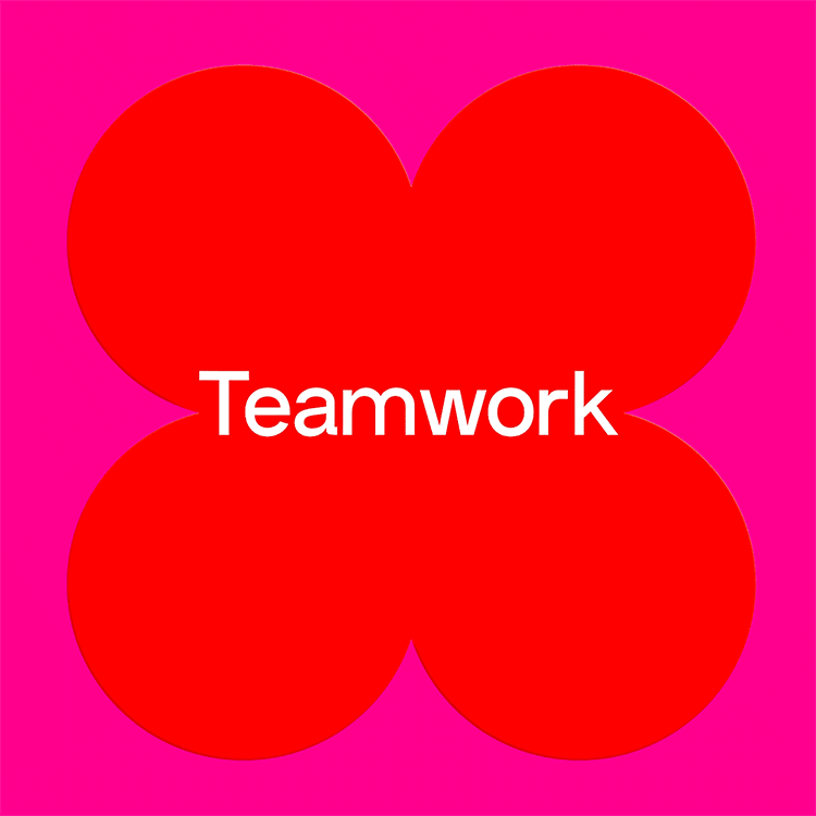
The 'O' in MOOCO is creatively transformed to represent each of the studio's four pillars, connecting with clients' project needs.
Branding Design:
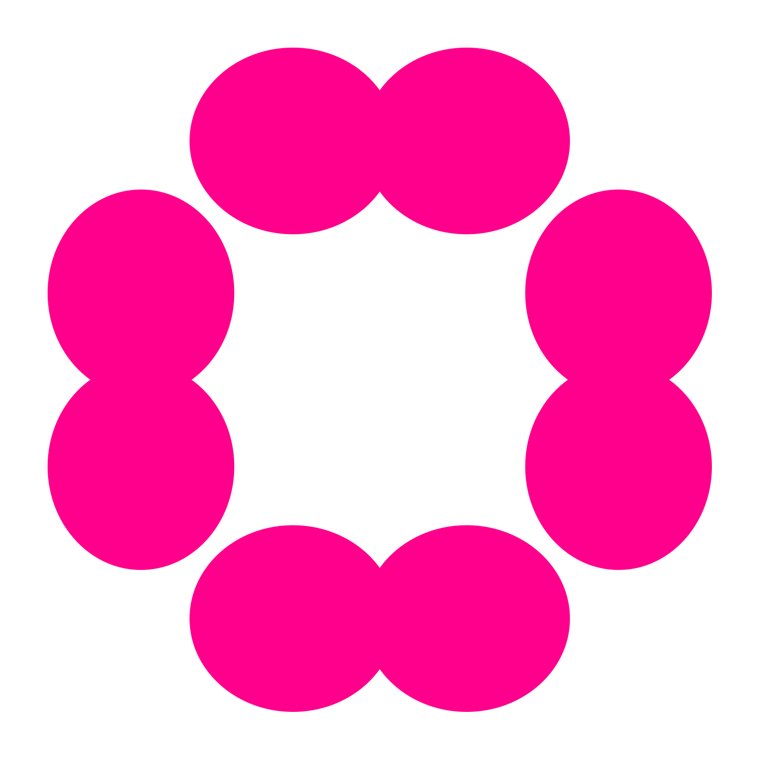
The first 'O' is stylized to resemble a dynamic and abstract brand mark, symbolizing MOOCO's expertise in branding design, creating a connection between the studio and clients seeking branding solutions.

3D Design:
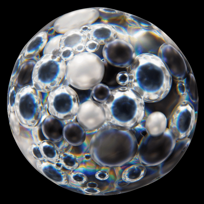
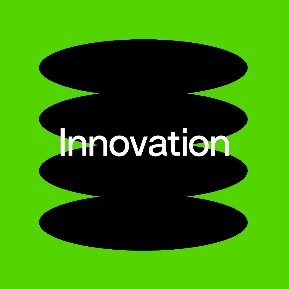
The third 'O' transforms into a three-dimensional sphere, showcasing depth and dimensionality, signifying MOOCO's excellence in 3D design, and connecting with clients seeking 3D modeling and visualization.

Animation:
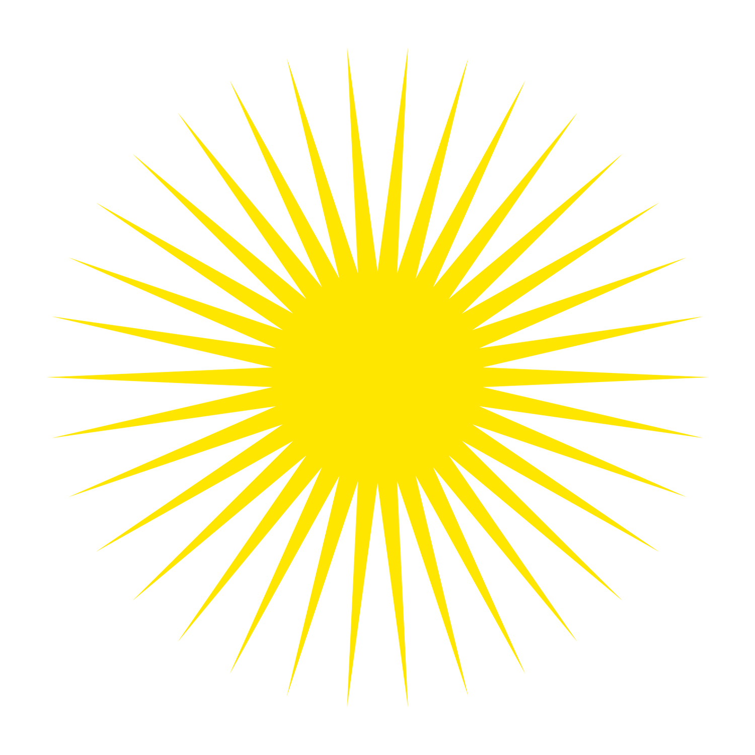
The fourth 'O' takes on fluid and curved lines, embodying motion and representing the studio's proficiency in motion graphics, connecting with clients in need of dynamic and animated content.
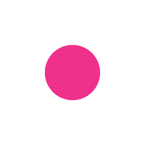
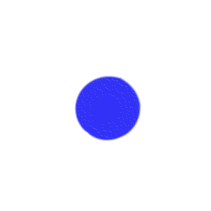
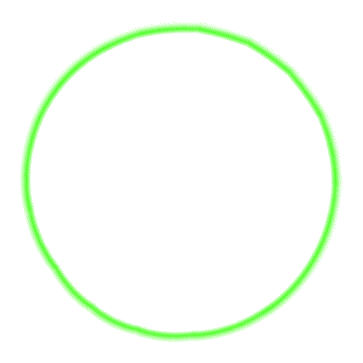
Illustration:
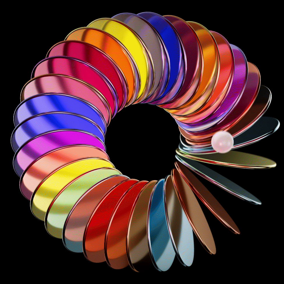
The second 'O' morphs into a brushstroke that artistically forms the 'O,' illustrating the studio's prowess in illustration, connecting with clients looking for artistic and illustrative elements.

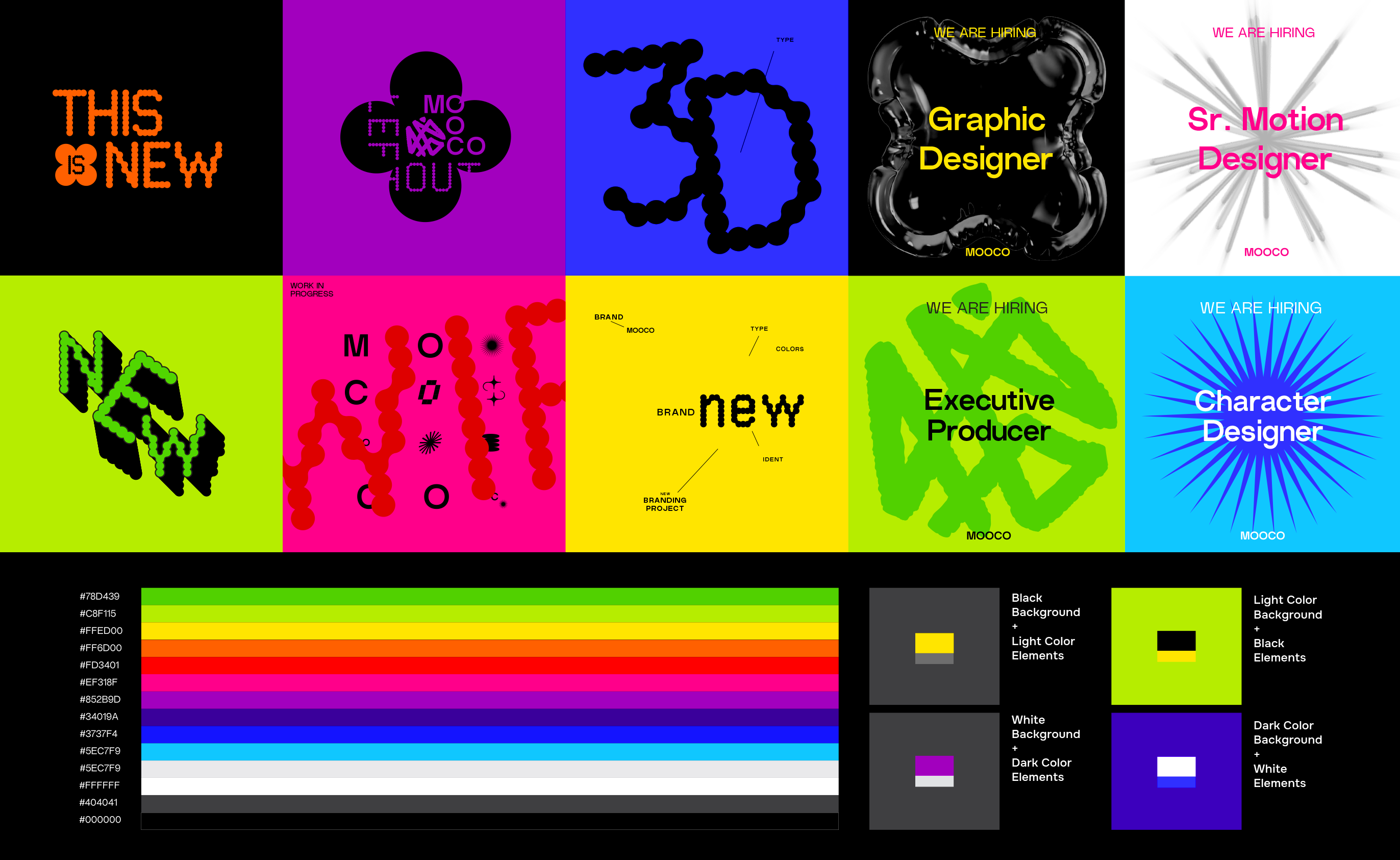
Color Palette.
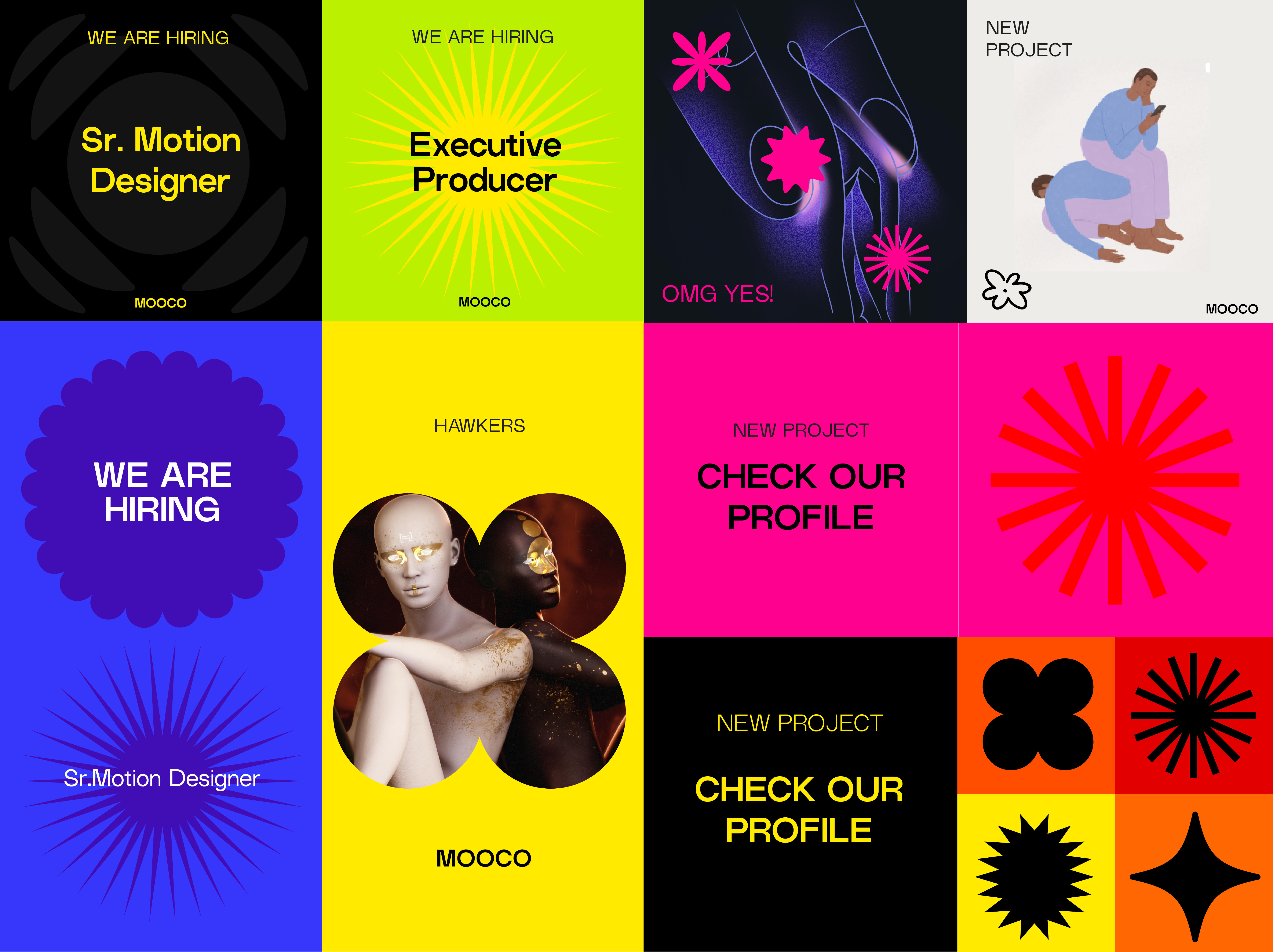
As a multidisciplinary studio, we believe that our color palette should be a reflection of our diverse and dynamic team. With over 75 talented individuals from various places, each bringing a wealth of unique ideas and perspectives, we embrace a vibrant and multicolored palette that mirrors the rich tapestry of our creative community.
Typography.
____
Non
Natural
Grotesk
A clean, sans-serif typeface is chosen for the MOOCO brand, reflecting modernity and clarity, aligning with the studio's commitment to cutting-edge design.
____
Secondary font
Onest
Google Font
The font combines capaciousness and legibility, so it saves space without losing readability.

____
Creative Font
AB Neuron
Adobe Font
This is a playful font selected only for a creative porpouse like Instagram post or desk titles.
Social media.
The rebranding of MOOCO successfully encapsulates the studio's four pillars of creativity while emphasizing the connection with clients, tailoring the logo to suit their specific project needs. MOOCO is now poised to make a bold statement in the design world, demonstrating its commitment to innovation, creative excellence, and client-centric design solution.