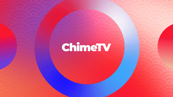
Client: VME
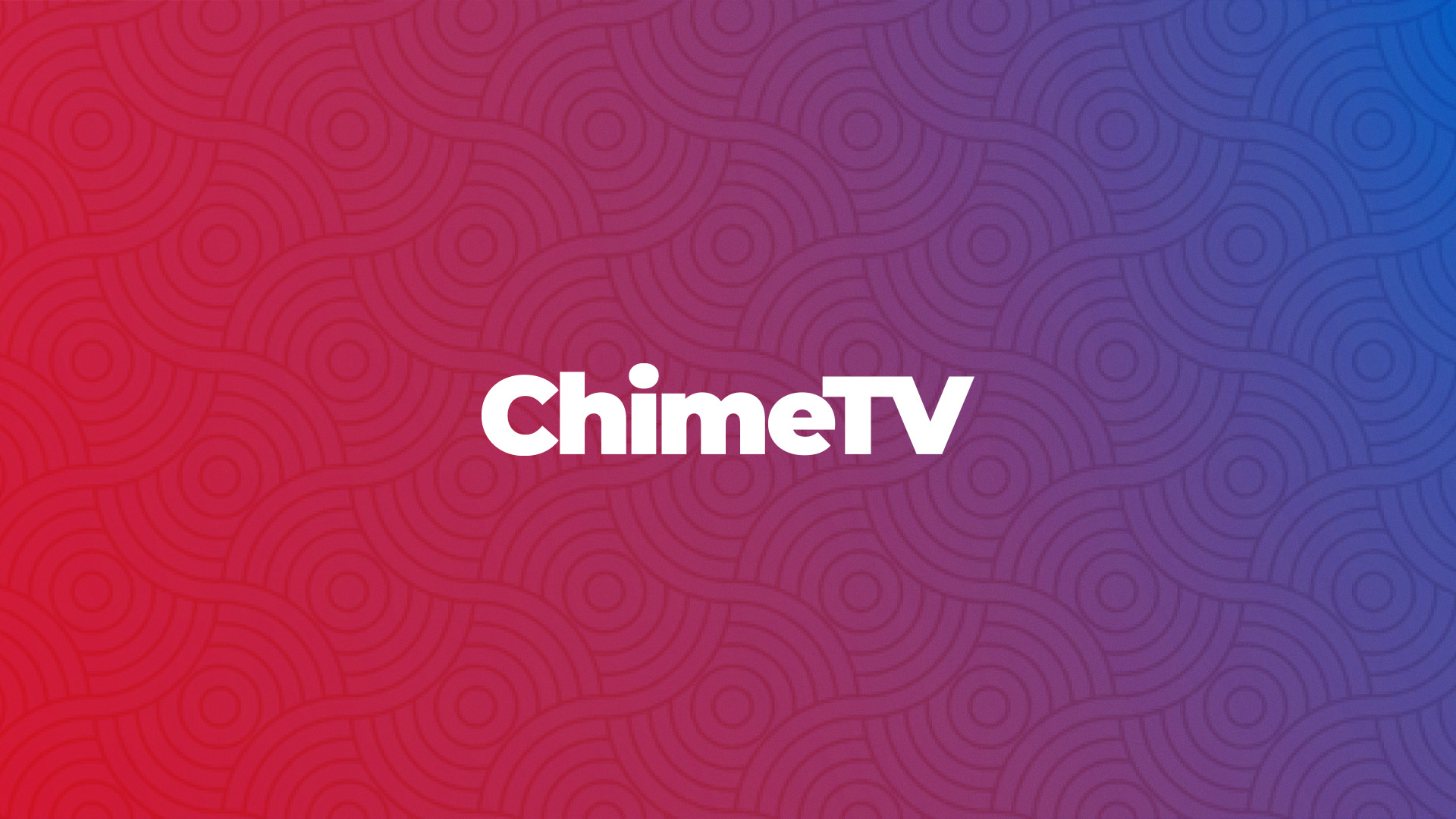
Project: ChimeTV
Crafting a new identity and bringing it to life through animation.
VME asked us to develop the visual identity for a new Asian television channel in the United States. The new channel covers different programme formats and different cultures so it was important not to focus on region-specific symbologies. In turn, the intention was to have a fresh and simple tone to reach a wide audience.


Design
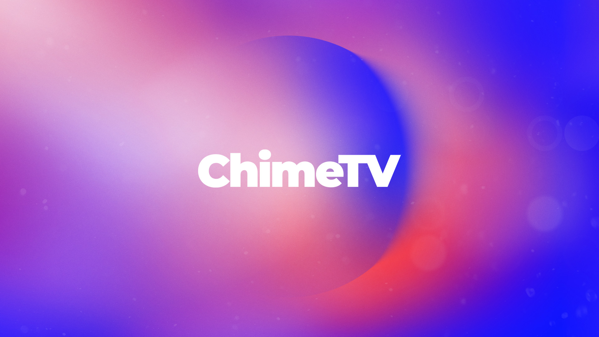
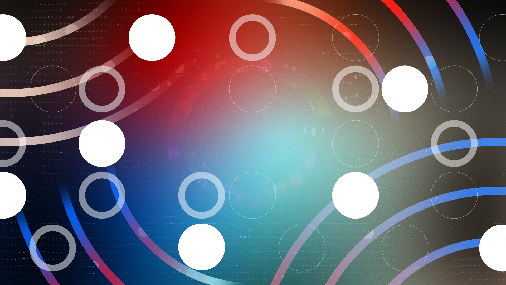
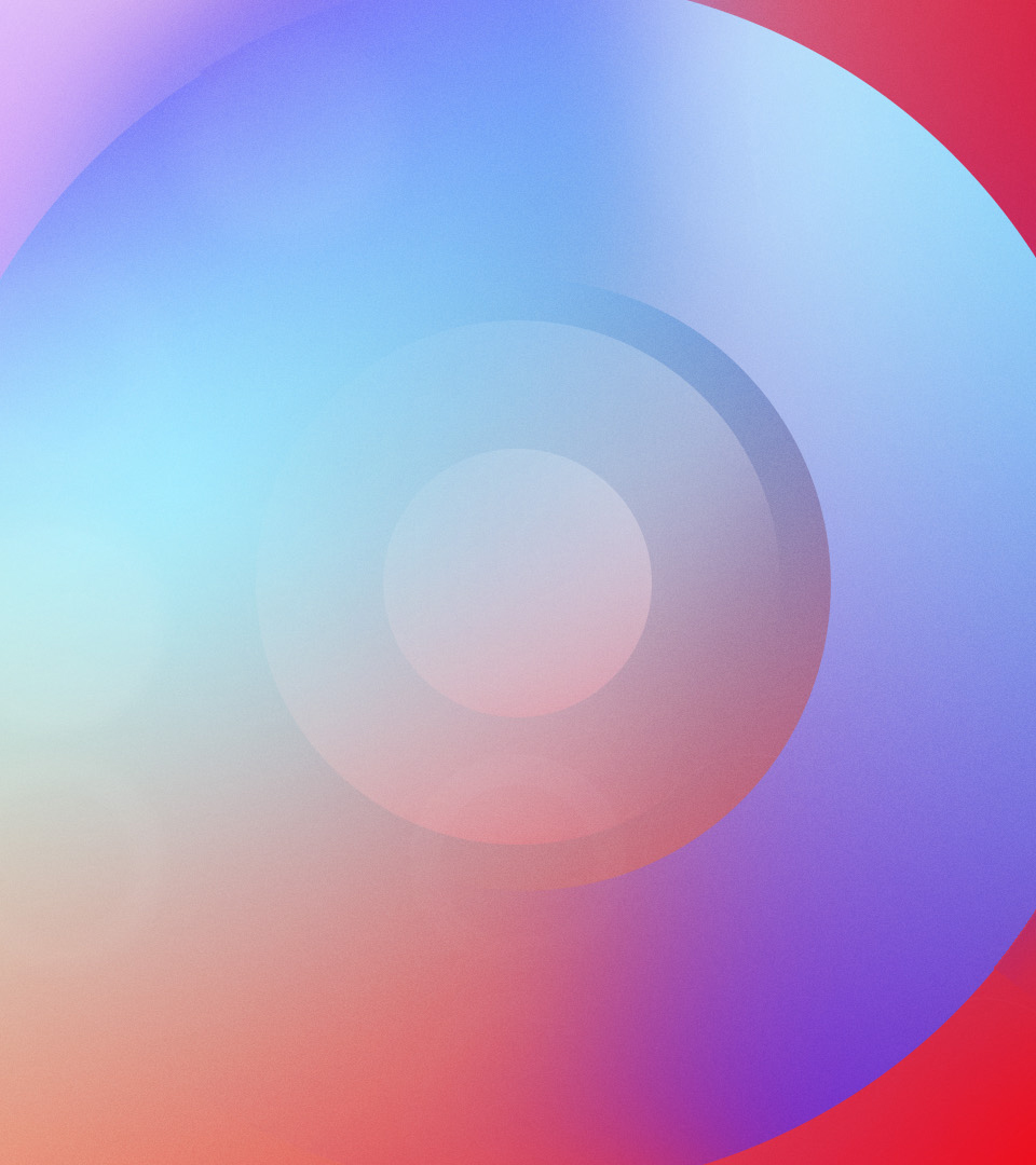
We received a customer draft, which included a limited color palette using a gradient and a pattern. To expand the graphic resources and build a broad visual identity in elements but consistent we decided to expand the color palette and generate new gradients, modifying its use to a non-linear form. Incorporate shapes, such as full circles and in different thicknesses. We also elaborate more dynamic patterns.
Typography
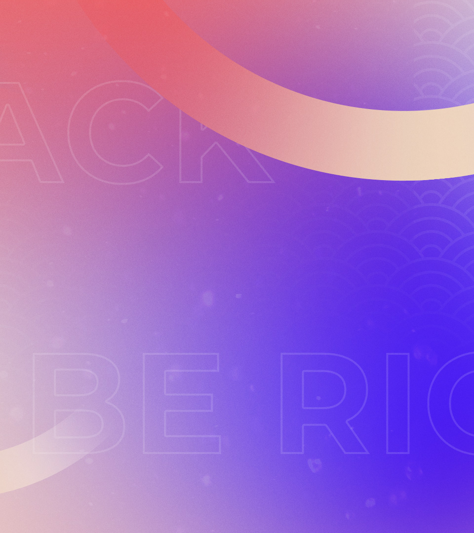
When it comes to typographic treatment, we prioritize readability on screen, emphasizing simplicity and clarity of the text. We contemplated using typography more creatively as a visual component in backgrounds. Blurring or outline the text is how it is used for this purpose.


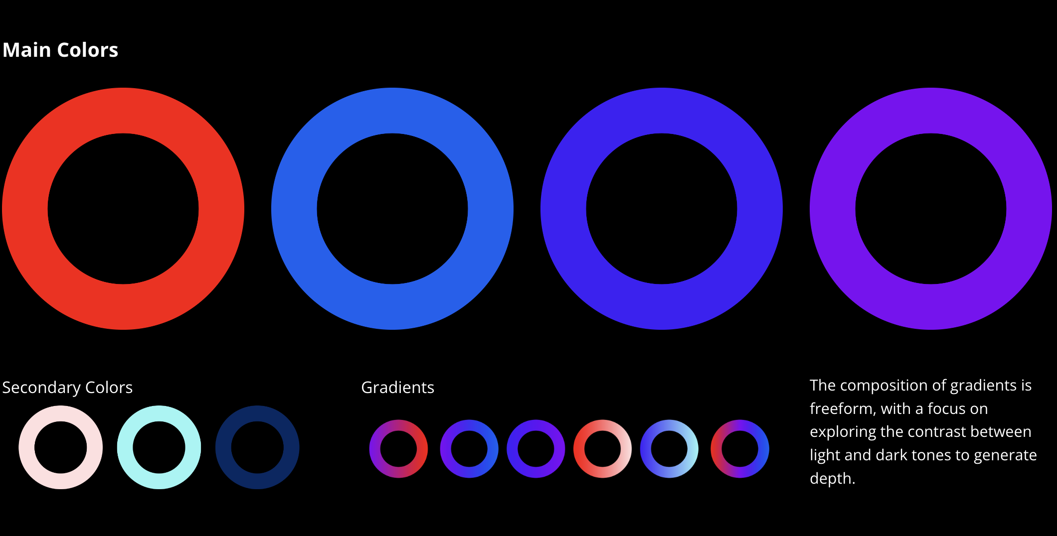
Color Palette
We follow the client's sketch's color direction, making adjustments to red and blue shades and adding violet and purple to the main colors. The palette was expanded by introducing lighter and darker shades as secondary colors to complement the main ones and help create gradients.

Patterns
Circular elements in different thicknesses were utilized to create visual identity's patterns. The composition of the patterns sought to evoke dynamism and expansion without neglecting contemplation, tranquility and stillness.


Animation
For the animation the aim was that the circles were the main element with a pop up movement and that the backgrounds have a subtle movement reinforcing the duality between dynamism and stillness.
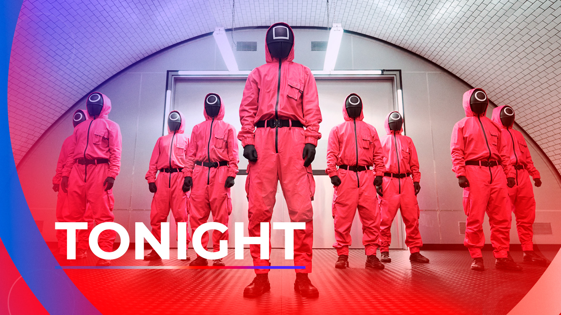
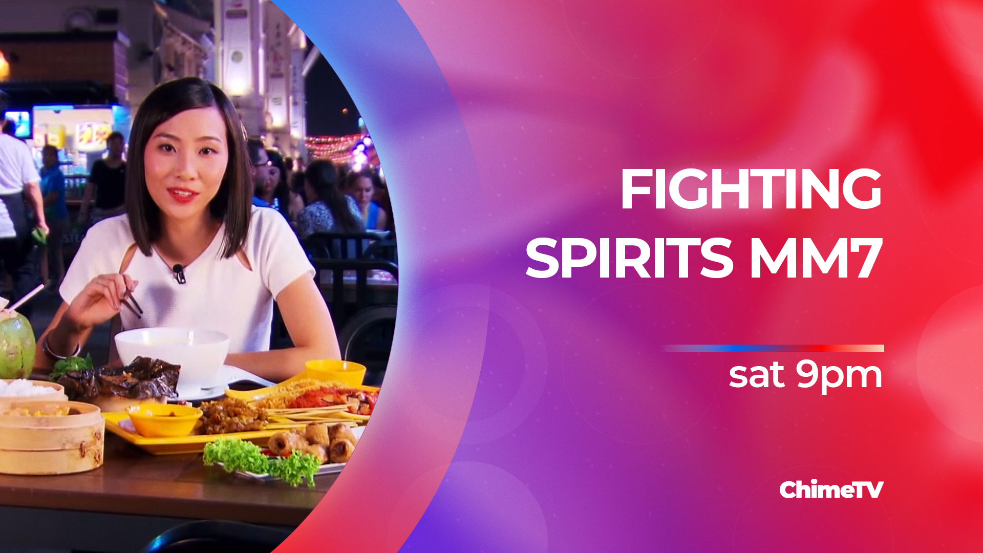
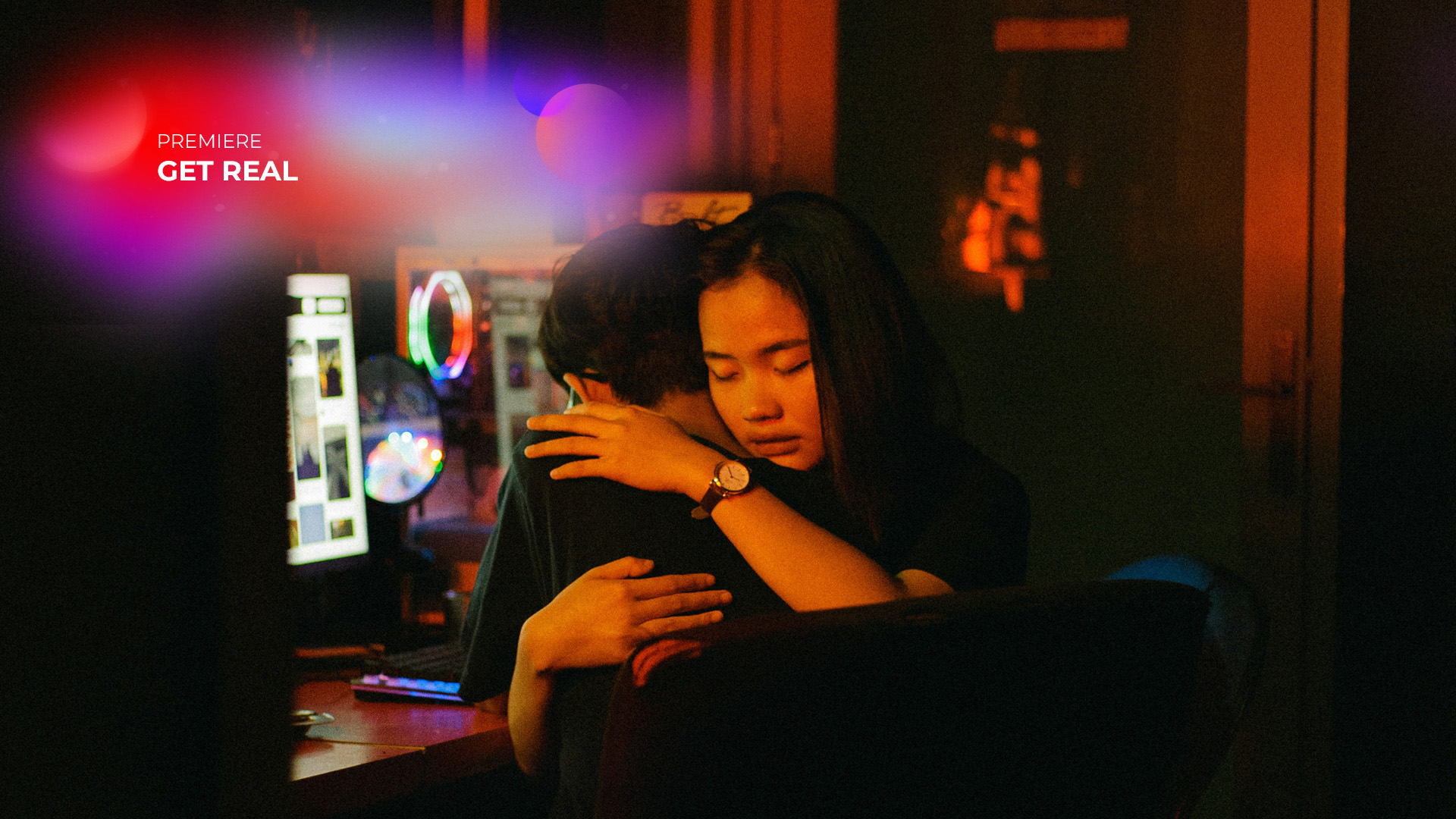
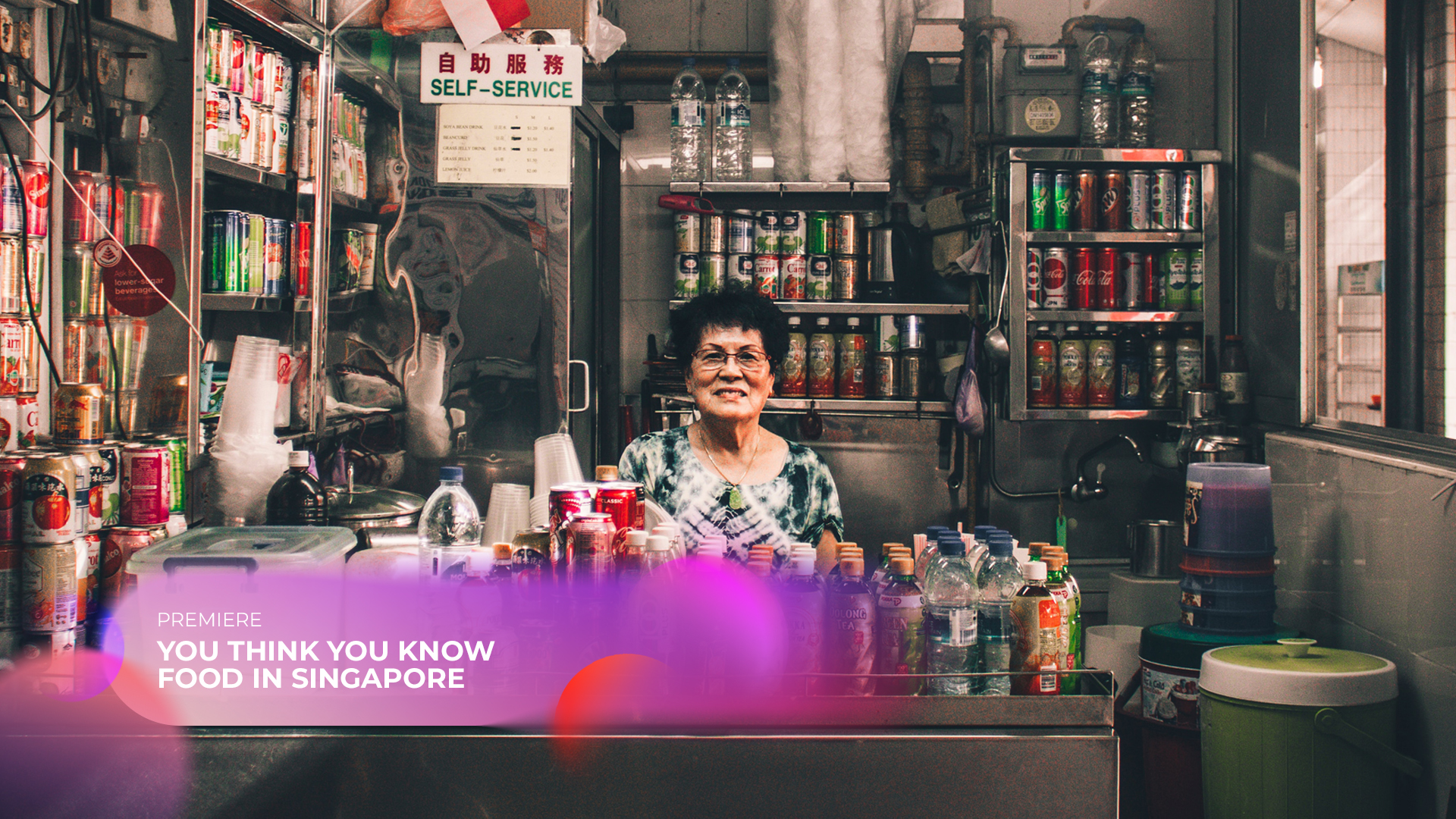
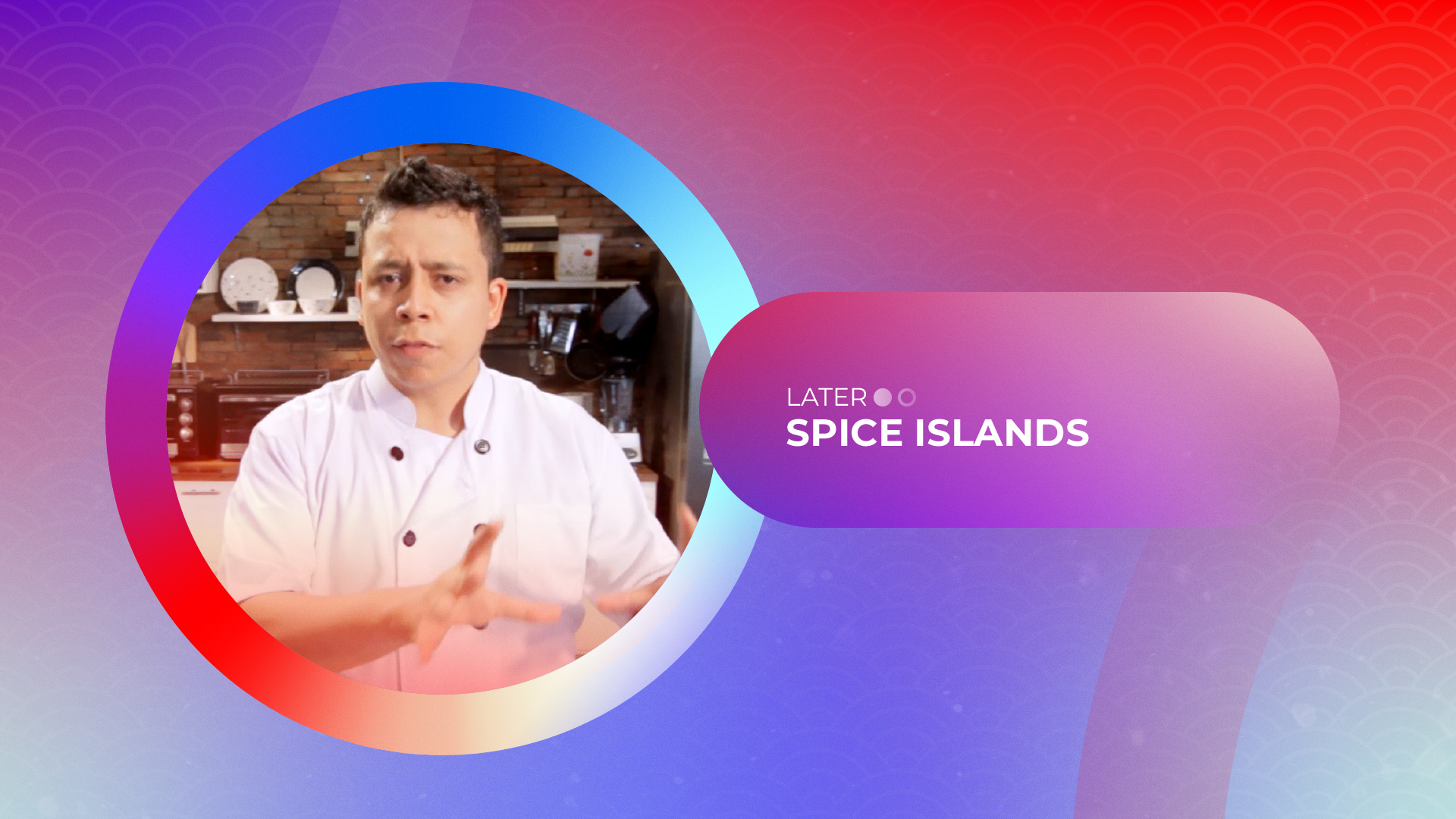
Promo Toolkit
Title Card
Background

Background
Endpage
Hey there, this is the default text for a new paragraph. Feel free to edit this paragraph by clicking on the yellow edit icon. After you are done just click on the yellow checkmark button on the top right. Have Fun!

Upper third
Lower third

Close
Transition
Navigationals
Bumper Next On


Bumper In
Bumper Out
Line Up (Menu)
Channel Bug