In Search of
the Opposite
Design as an act of exploration
Humans are constantly drawn to what they don't have. When everything moves fast, we seek calm. And when systems become rigid, we seek emotion.
In Search of the Opposite frames design as an act of exploration, a conscious movement toward what feels absent, distant, or unexplored. Here, aesthetics are not reactions, they are pursuits built from curiosity, contrast, and desire.
Design becomes a way to cross to the other side. Not to escape reality, but to complete it.
- 01 Back to the Playground ↓
- 02 Calm After The Storm ↓
- 03 Handmade Rebellion ↓
- 04 Nature As Interface ↓
- 05 Chaos As Relief ↓
- 06 Intimacy In Public ↓
Back to the
Playground
As automation accelerates, the human impulse shifts. When systems decide, generate and optimize everything for us, the need to create returns with urgency. Almost instinctively.
In response to automation, we go back to doing things ourselves. Playing, experimenting, assembling. Reclaiming our essence within digital spaces. It's not about escaping the internet, but reconfiguring it. Nostalgia for the web we once knew turns into construction: new digital territories that are more personal, more handmade, more imperfect.
Digital spaces fill with playful systems and unfinished gestures. Interfaces feel modular, experimental, sometimes intentionally naive. Drag-and-drop logic, visible grids, bold colors, raw interactions, and improvised compositions replace polished perfection. Here, the internet becomes a playground again. Less optimized. More human.


- Play as a form of cultural resistance, playing, experimenting, and 'breaking' systems becomes a creative gesture in response to increasingly rigid, productivity-driven environments
- Humanizing the digital, in opposition to cold, optimized interfaces, this current brings imperfection, error, and personal expression back to center
- Playful systems: interfaces that invite exploration rather than optimization, non-linear and not entirely predictable
- DIY, unfinished gestures, and drag-and-drop logic, less polish, more gesture
Calm After
The Storm
When the world becomes noisy, design learns to whisper. In moments of social tension, political violence, information overload, or permanent crisis, the human instinct turns inward. When reality becomes aggressive, design responds by softening its edges.
Calm after the storm describes an aesthetic movement in which digital space transforms into a place of pause. Interfaces slow down. Color palettes desaturate. Motion becomes subtle, almost meditative. White space expands. Noise dissolves.
Here, calm is not neutral, it is intentional. A form of design that offers relief, grounding, and clarity. Minimalism takes on emotional weight. Soft gradients, natural rhythms, slow interactions, and restrained typography become tools to counteract external chaos.





- Digital spaces replace physical shelters, design begins to take on an almost therapeutic role: to contain, to organize, to slow the pulse
- Calm becomes a countercultural gesture, choosing calm is a way of going against a system dominated by infinite scroll and constant stimulation
- Soft, desaturated color palettes that reduce visual stimulus and allow the eye to rest
- Generous use of white space, emptiness becomes structure, organizing and slowing the reading rhythm
Handmade
Rebellion
An excess of digitalism and technology leads to a proliferation of handmade and DIY aesthetics. Handmade Rebellion emerges as a counter-movement to hyper-digital perfection. Rough cuts, imperfect alignments, visible glue, scanned textures, scribbles, photocopies. What appears unfinished becomes intentional.
Here, artisanal intelligence comes into play, a form of knowledge embedded in making itself, in repetition, intuition and material memory. Not learned from data, but from practice. In a world optimized by algorithms, DIY becomes a statement: a way to slow down, reclaim authorship, and assert a different kind of intelligence.

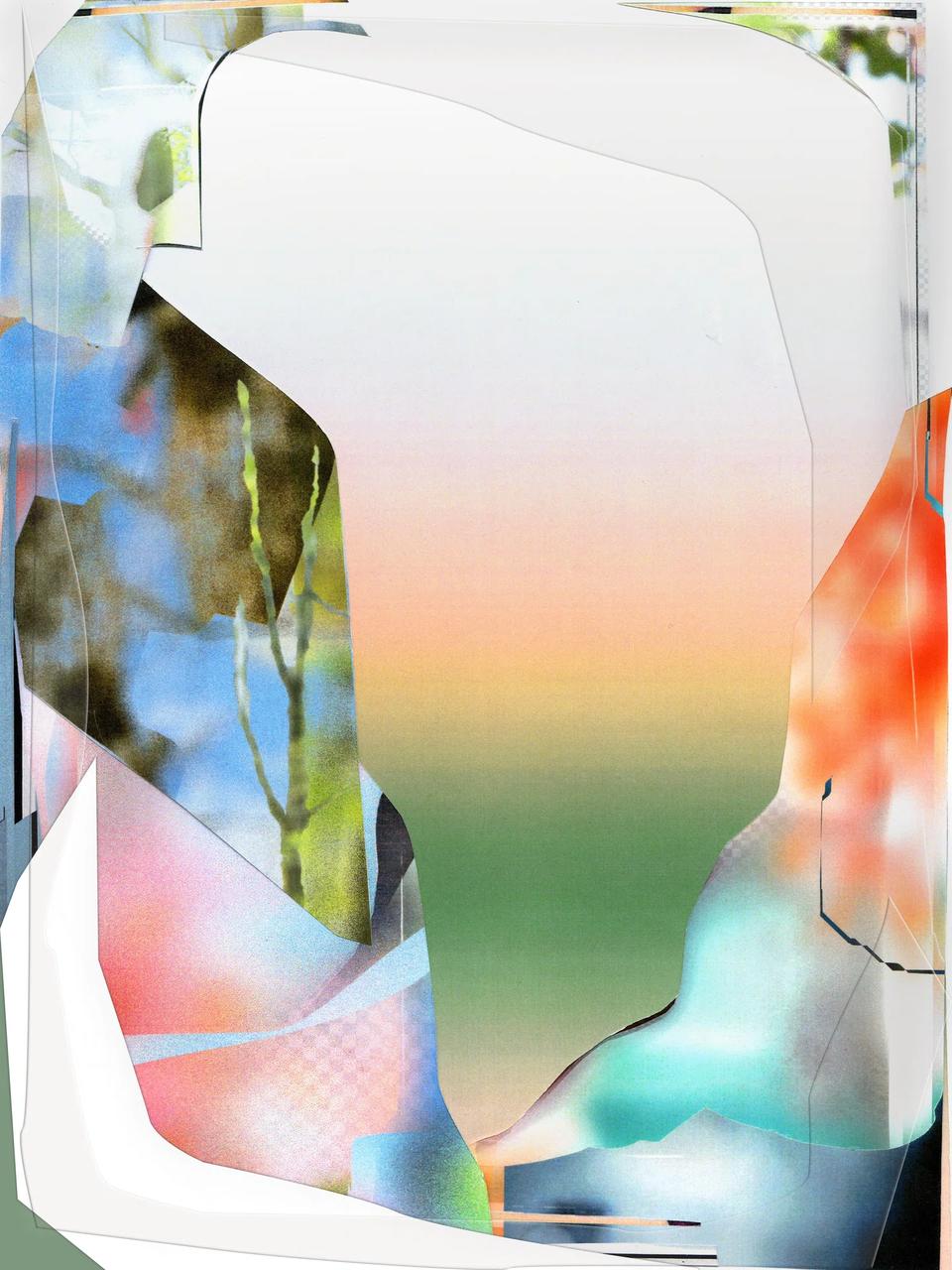

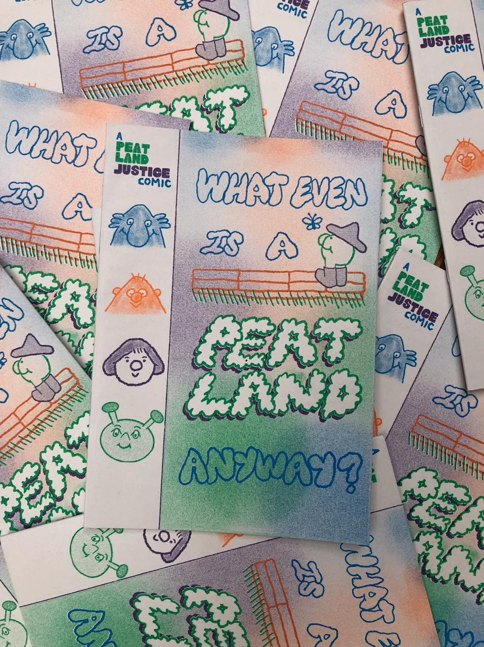

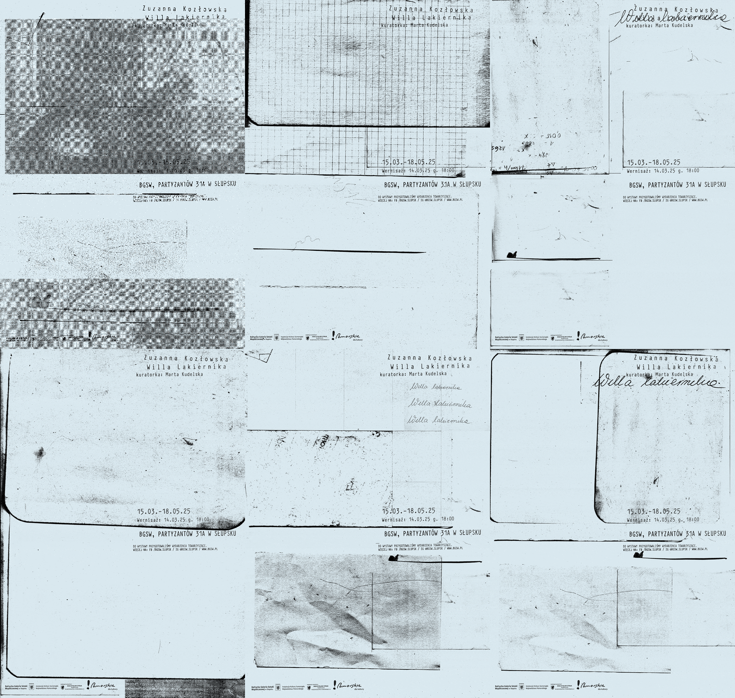


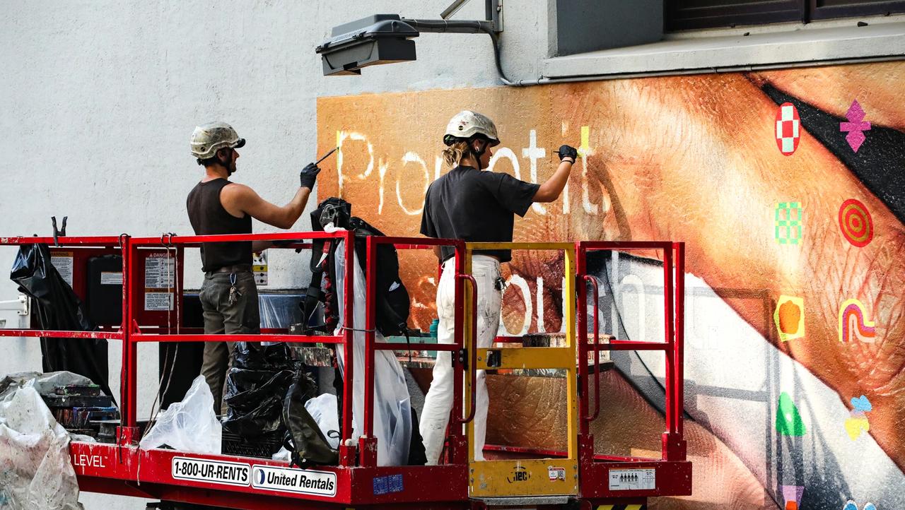

- A direct counter-movement to AI-generated perfection, the human hand as a form of authenticity
- Artisanal intelligence: knowledge embedded in making, not in data
- The visible imperfection becomes a signature, a proof of authorship
Nature As
Interface
As screens become ubiquitous, designers are turning to the natural world as both subject and structural model. Nature As Interface explores how organic systems, the branching logic of trees, the cellular structures of biology, the fluid dynamics of water, are being translated into visual and interaction design.
This is not mere decoration with leaves and flowers. It's a deeper inquiry: what if interfaces behaved like ecosystems? What if visual hierarchies followed the logic of growth? What if color systems drew from the palette of the natural world in its full complexity?




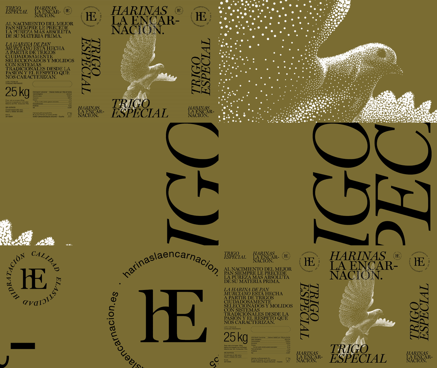

- Organic structures as compositional frameworks, growth logic applied to layout and hierarchy
- Biomorphic forms that feel alive, responsive, and evolutionary rather than static
- Color derived from nature's complexity, not simplified palettes, but the full spectrum of natural variation
Chaos As
Relief
When everything is optimized, chaos becomes a relief. Chaos As Relief describes a deliberate aesthetic of disorder used not as protest, but as pleasure, the visual equivalent of taking off your shoes after a long day. Overstimulated by algorithmic perfection, some designers are finding joy in the deliberately disorganized.
This is distinct from Messy Design's critical stance. Chaos As Relief is playful, affectionate, even gentle in its disorder. It's the aesthetic of the junk drawer, the overflowing bookshelf, the kitchen table covered in projects. Abundance over minimalism. Presence over polish.


- Disorder as comfort, the visual equivalent of lived-in, well-used spaces
- A response to the emotional exhaustion of constant optimization and curation
- Abundance as an aesthetic value, more is more when it expresses authentic presence
Intimacy In
Public
Social media has collapsed the boundary between private and public. Intimacy In Public explores the aesthetic consequences of this collapse, design that presents the personal, the vulnerable, the domestic as valid public visual language.
Candid photography, personal handwriting, domestic spaces, close-up portraits, and unpolished moments become the building blocks of brand communication. The aspiration is to authentic connection: brands that feel like friends, communications that feel like confessions, visual languages that feel like being let in.


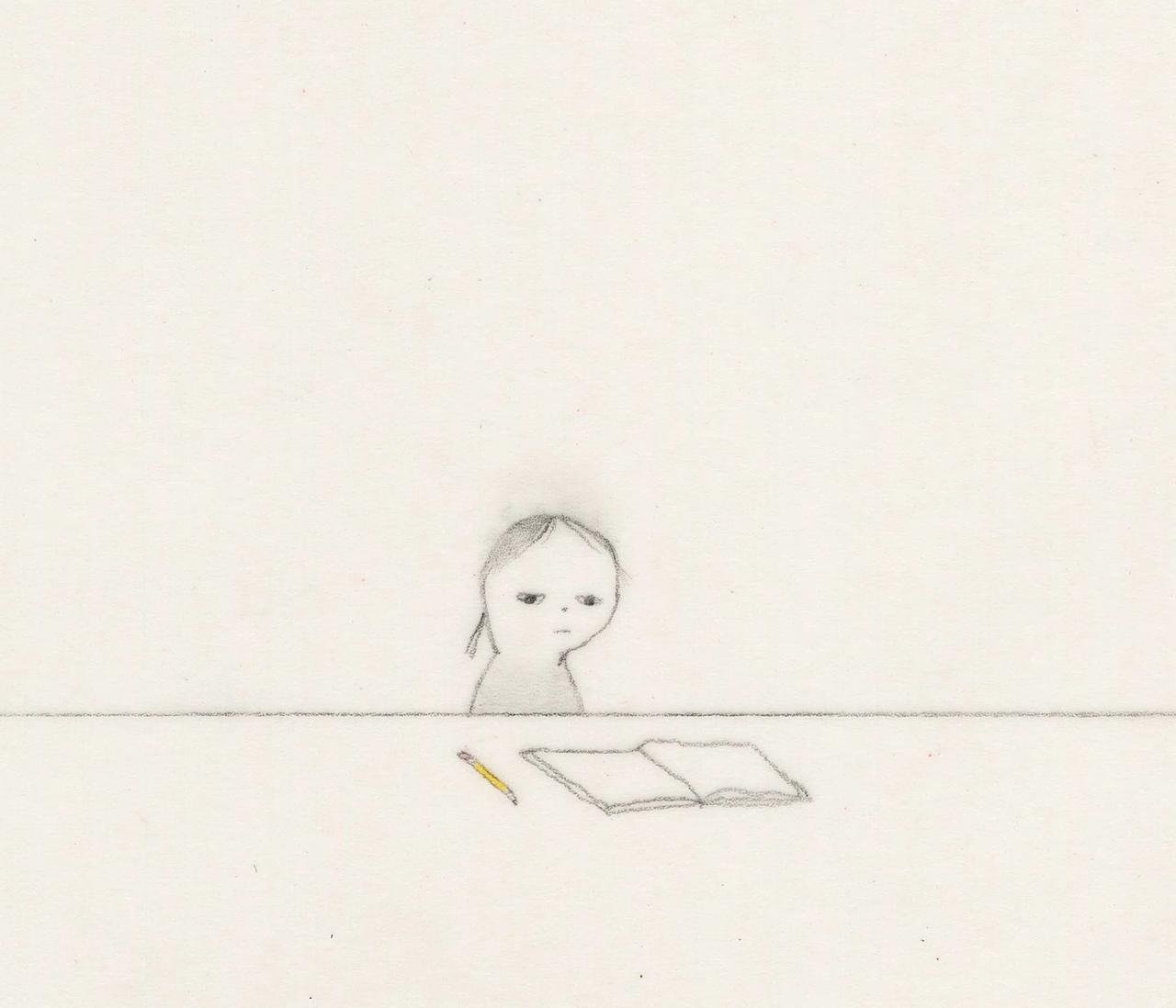

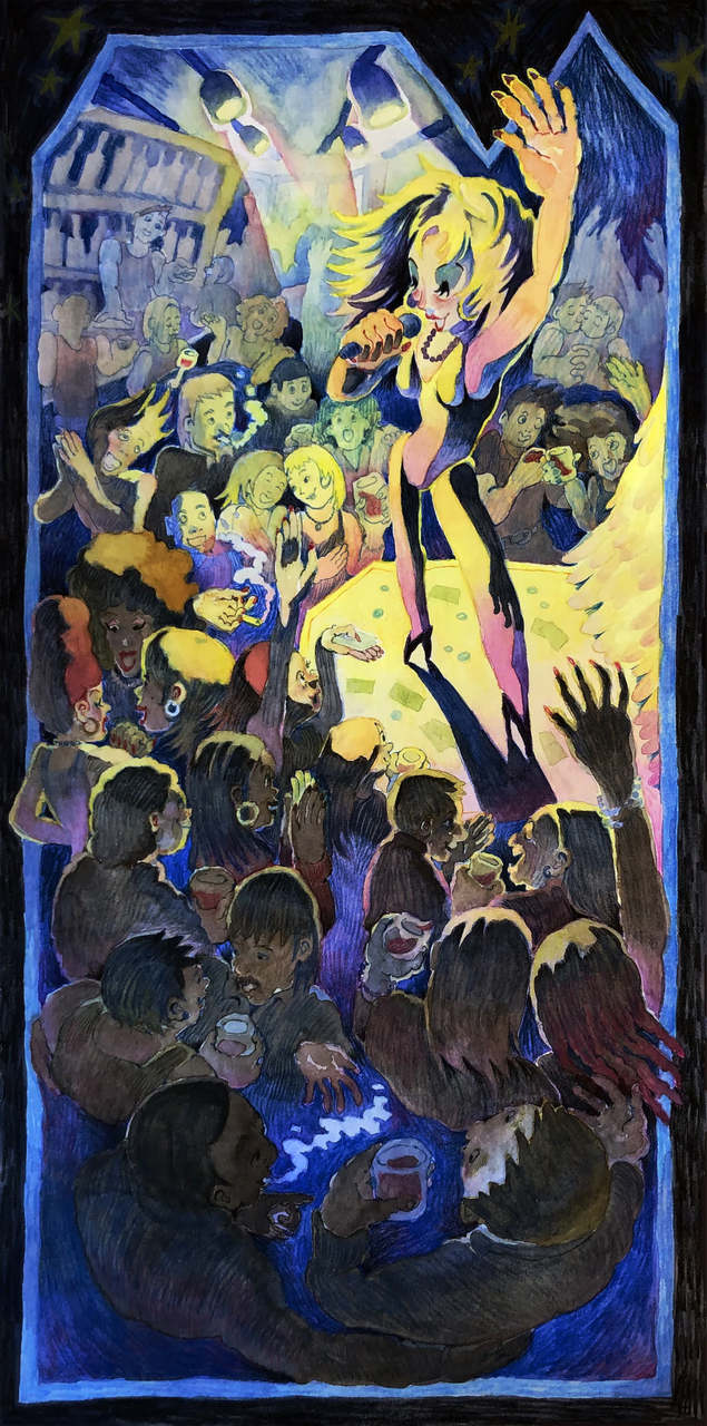


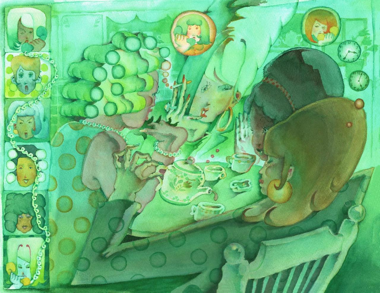


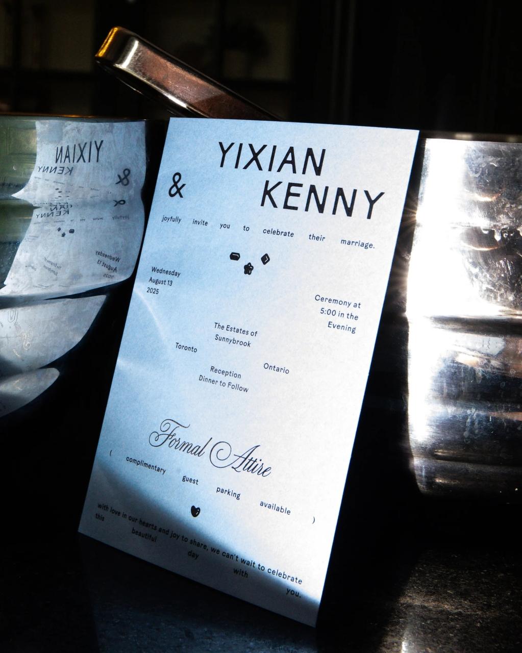

- The personal as the political, and the commercial: intimacy as a communication strategy
- Raw, unpolished aesthetics signal trust and authenticity in an era of high production values
- The domestic and the vulnerable as aspirational, audiences seek connection, not perfection