From Reality
To Digital
Reality Resists
In a world increasingly polished, rendered, and optimized, the real, with weight, texture and flaws, resists disappearance. Designers, artists, and visual creators are beginning to reconnect with the physical, bringing the marks of the tangible world back into the digital realm.
Stains, wrinkles, strokes, scanned paper, tape, fingerprints, natural textures: all that was once considered a flaw now becomes an expressive tool.
This trend isn't just an aesthetic gesture. It's an act of resistance against the inert nature of pure digital design. In an environment where everything leans toward vectorial perfection, the 'error' becomes human. The handmade coexists with software. The organic enters into dialogue with the algorithm.
- 01 Sticker Domination ↓
- 02 Feel The Texture ↓
- 03 Sound Visualizing ↓
- 04 Grime Revival ↓
- 05 Orbital Design ↓
- 06 Crystal Mechanics ↓
Sticker
Domination
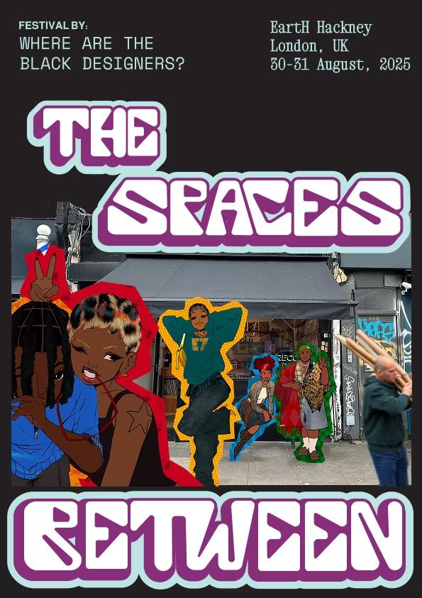
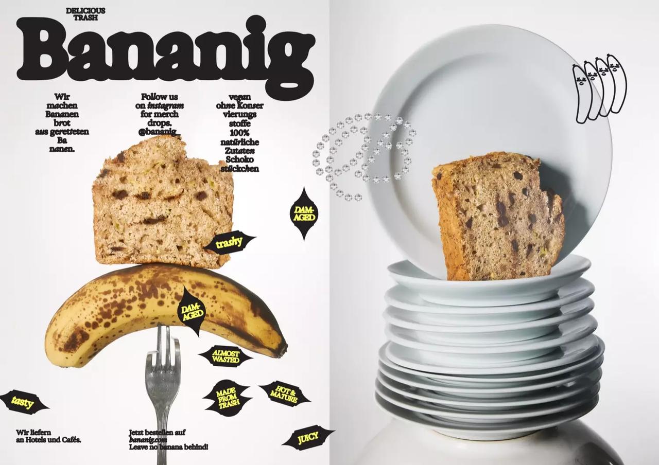
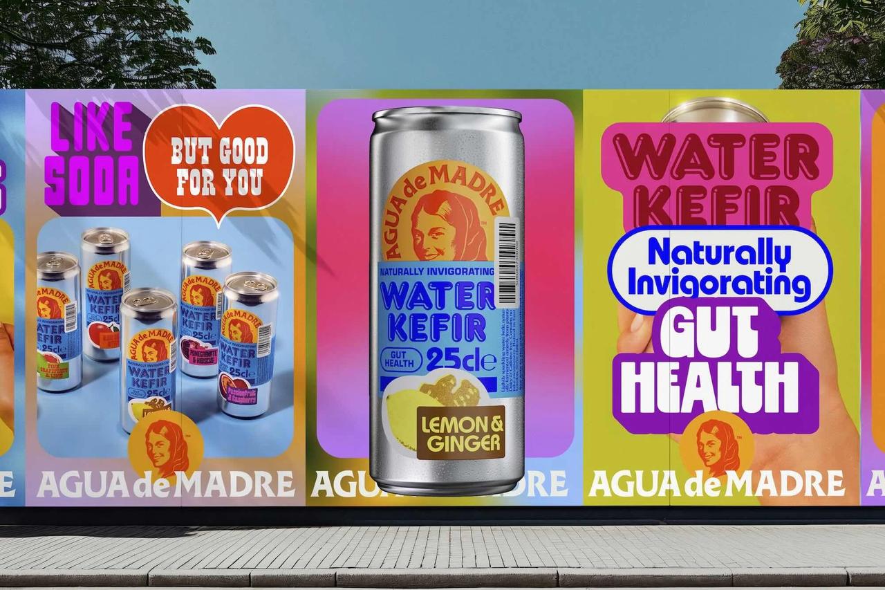
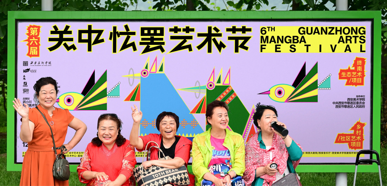
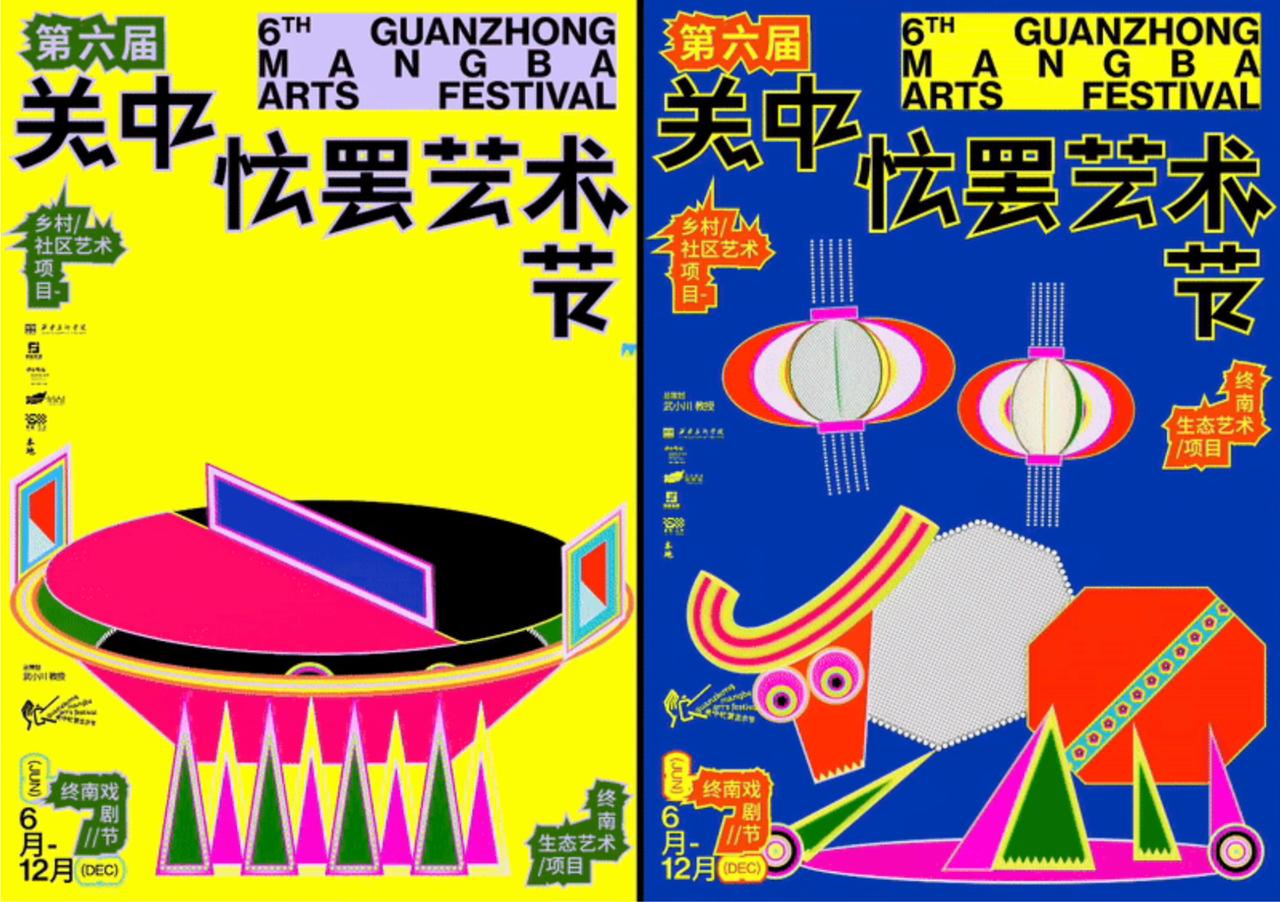
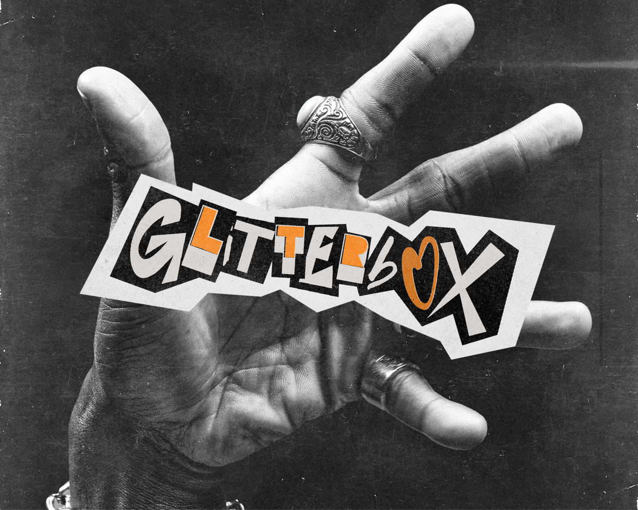
The chaotic, playful, and tactile looks of the sticker world have made their way into the digital realm, becoming a key player in contemporary graphic design.
What was once a decorative detail or a symbol of teenage rebellion is now a dominant visual language: cut-out typefaces, 'pasted' effects, arrows, icons, labels, irregular frames, and shiny shapes stack on top of each other, flooding the composition with raw energy.
Drawing from street culture, indie editorial aesthetics, meme culture, sticker-covered signs, public bathrooms, and adolescent notebooks, this trend brings a joyful mess into modern interfaces, breaking away from minimalism and injecting the physical chaos of the real world into the clean order of the digital.




- It allows for layers of information and visual interaction
- It plays with hierarchy in a more eye-catching way
- It resonates with generational visual codes
- Irregular shapes, overlapping layers, sticky-looking type, arrows, and speech bubbles
Feel The
Texture
From the desire to reconnect the digital with the physical, in an environment saturated with clean, flat, perfectly rendered images, this aesthetic pushes back by bringing the tangible to the forefront: skin, fibers, wrinkles, dust, moisture. The focus is on real textures and how they feel. Not just how they look.
It doesn't aim to imitate reality, but to bring it into the digital space to spark sensations, create intimacy, and craft visuals that aren't just seen, but almost felt.


- It rehumanizes the digital by evoking physical sensations and reconnecting the viewer with the sensory and the tangible
- Visually distinctive in a homogeneous feed
- It plays with the friction between clean 2D graphics and physical textures that break away from today's visual cleanliness
Sound
Visualizing
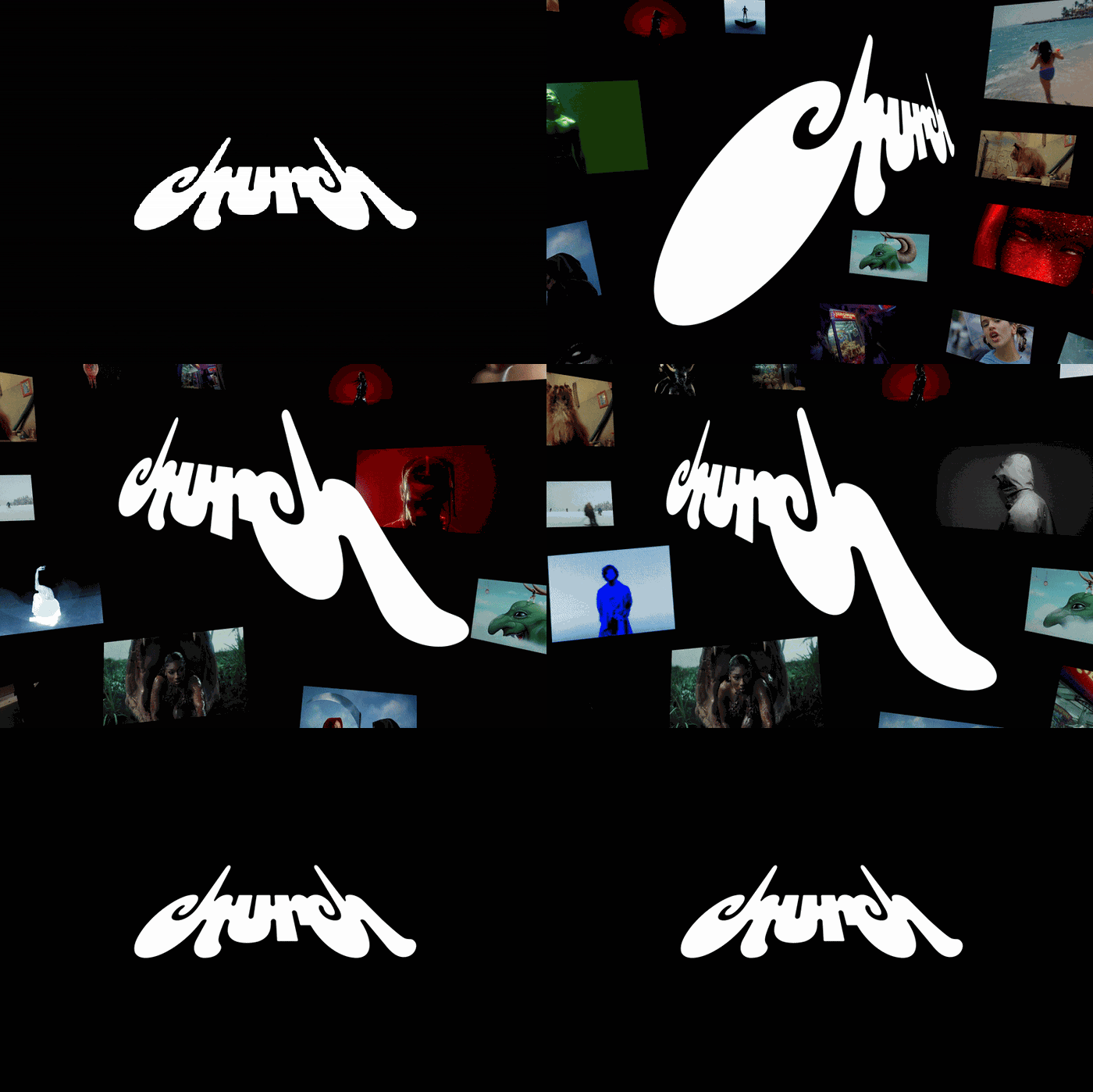
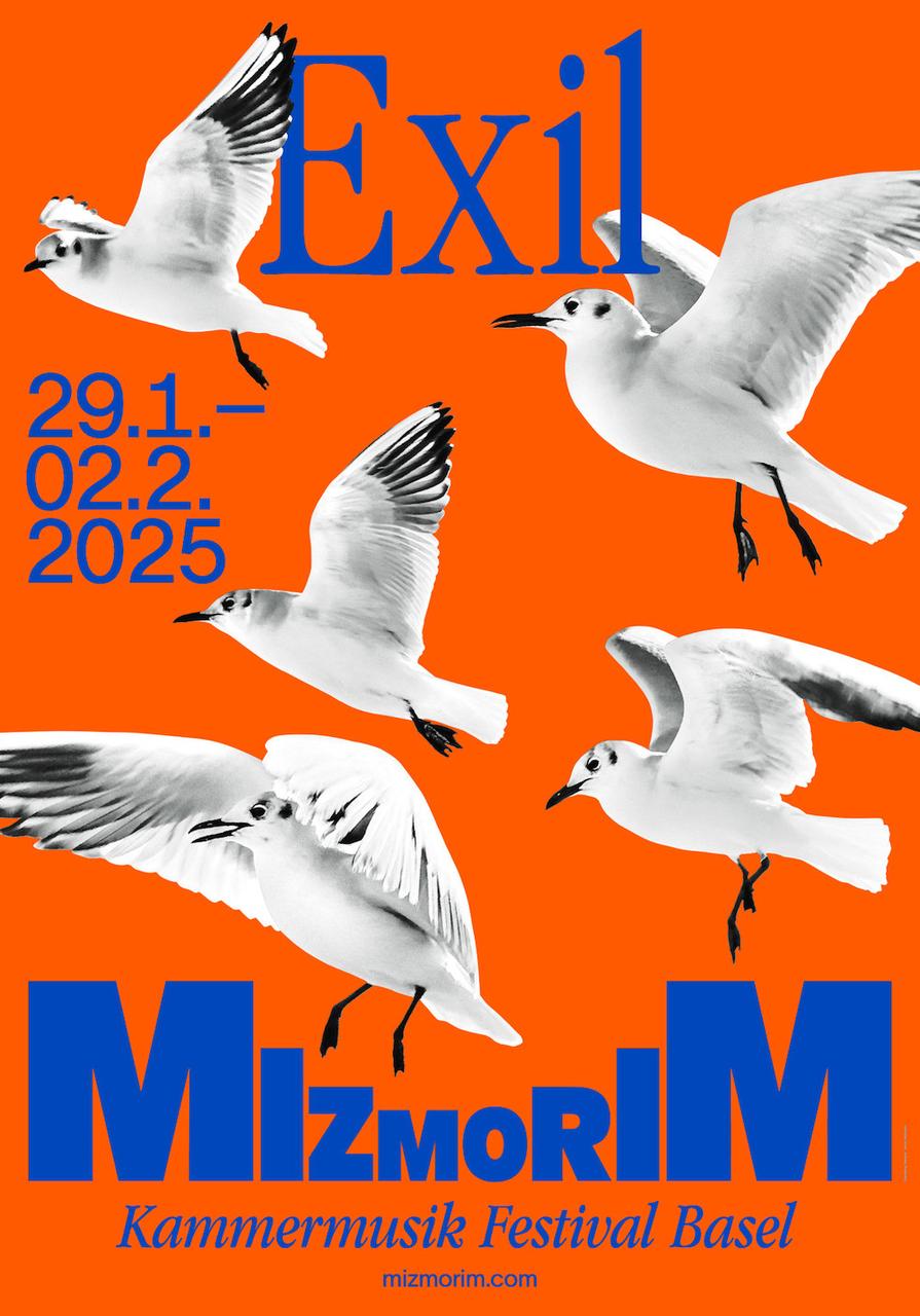
Here, design becomes visual sound. It's a graphic exploration that seeks to represent the energy, cadence, and volume of sound through shapes, typographic weight, direction, and visual rhythm. It's as if the typographic composition had a voice and movement, as if every word or element could vibrate, shout, whisper, or bounce across space.
This style often incorporates extreme contrasts in font sizes, perspective play, tilts, stretches, or distortions, like typography could sound louder, deeper, or faster. It may also use photography, negative space, graphic echoes, or calligraphic gestures to reinforce that sonic dimension.


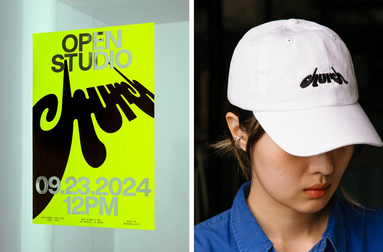
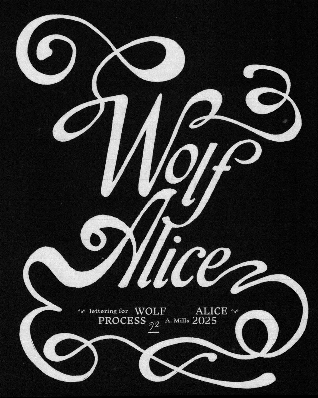

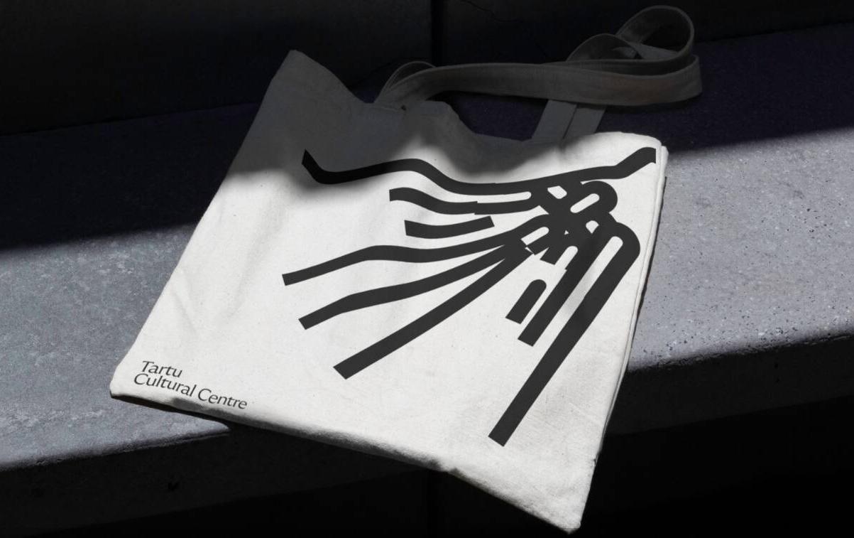


- Designs from a sensory experience, not just a visual one
- Even when static, its composition conveys rhythm and movement
- Challenges traditional notions of legibility and hierarchy
Grime
Revival
In this trend, dirt isn't a flaw, it's a feature. Lens scratches, digital dust, aggressive grain, bleeding ink, analog distortions, and beaten-up textures form a visual language that embraces messiness as a mark of authenticity.
Far from aiming for cleanliness, it proudly brings the aesthetic disorder of the physical world into the digital realm. Imperfections become a signature: what's broken, dirty, or seemingly degraded is carefully curated to evoke a raw, visceral, emotional atmosphere.
This style carries a gritty sensitivity, somewhere between punk, indie editorial, '90s nostalgia, and photocopied rave flyers. Everything hums with a textured energy that reclaims the manual, the worn, the once-physical, now revived on screen.


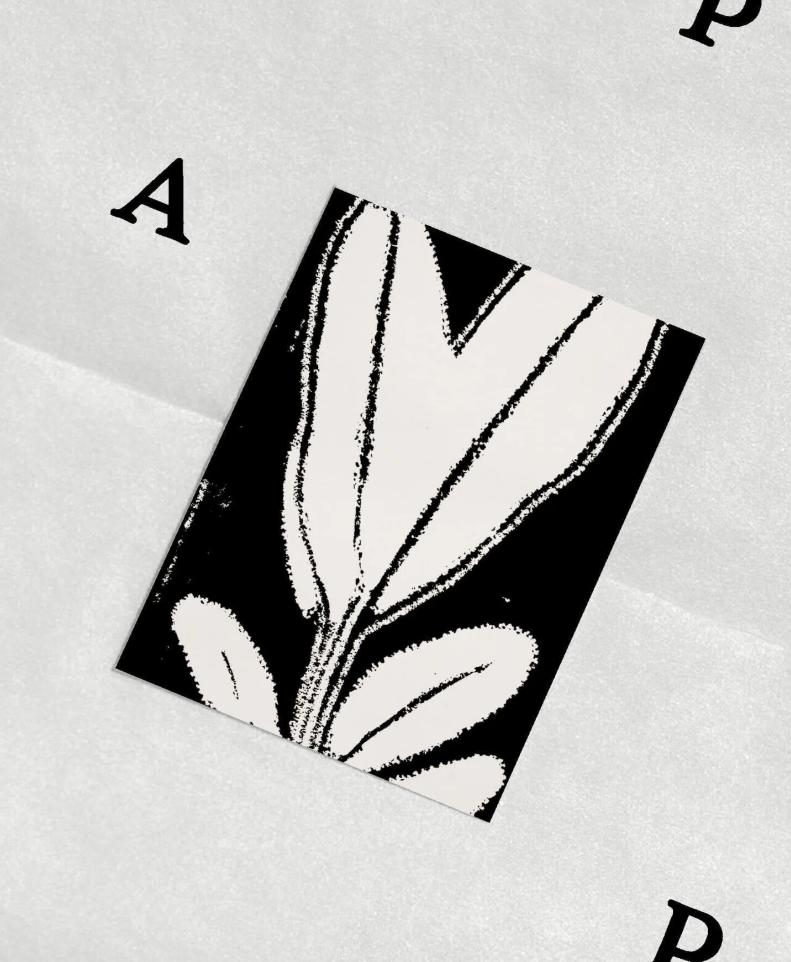


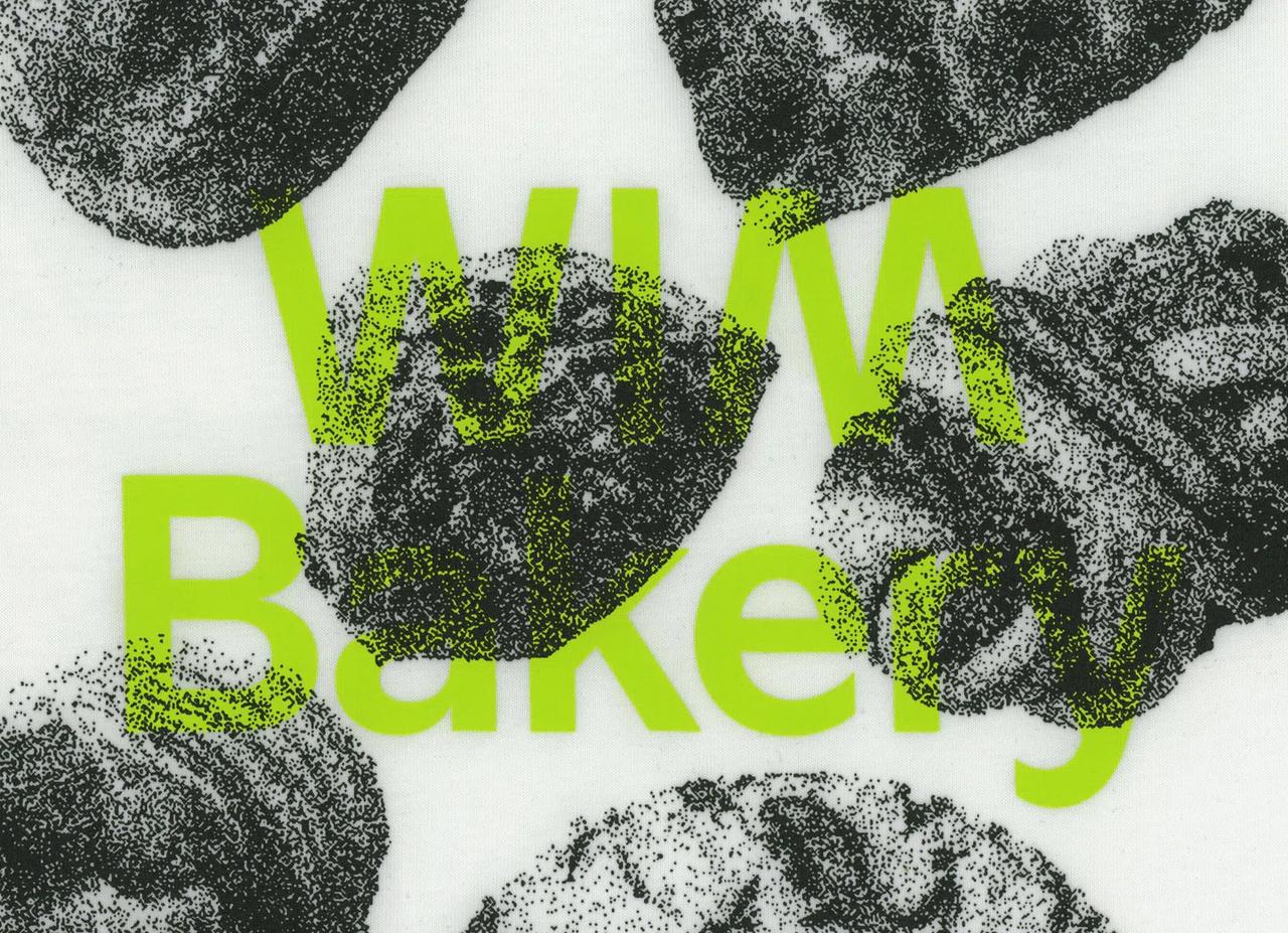
- Inspired by what was once underground and disposable: flyers, fanzines, album covers, scans, and photocopies
- Error becomes a visual language
- Decay is reimagined as a contemporary design tool
Orbital
Design
Orbital Design draws from the visual language of science, space exploration, and celestial mechanics. Circular paths, radiating grids, planetary systems, and the geometries of orbits become compositional frameworks for contemporary graphic design.
This aesthetic merges the precision of scientific visualization with a poetic sensibility, where data becomes beauty, and movement becomes structure. Concentric circles, arc paths, dotted trajectories, and spatial coordinates serve as both decorative and organizational elements.


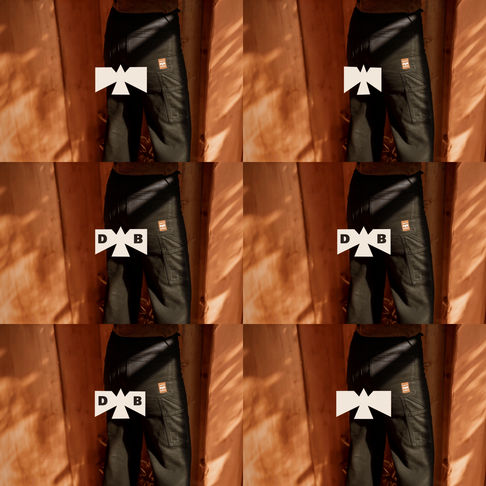


- Borrows the authority and precision of scientific imagery
- Creates a sense of infinite movement within a static composition
- Connects with a cultural moment fascinated by space, exploration, and the cosmos
Crystal
Mechanics
Crystal Mechanics explores the intersection of geometric perfection and organic structure, inspired by the forms found in crystalline minerals, molecular models, and structural lattices. Hard-edged, faceted, and refractive, this aesthetic brings a sense of architectural rigidity softened by light and transparency.
Where Orbital Design finds its poetry in motion and trajectory, Crystal Mechanics finds it in structure and refraction. Glass-like surfaces, prismatic color splits, wireframe geometries, and the visual logic of mineral growth define this visual language.

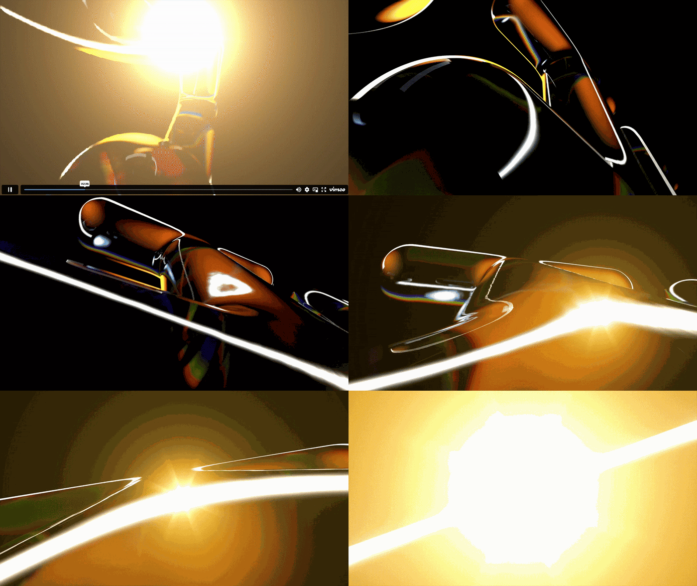


- Finds beauty in structure, where constraint becomes aesthetic
- Translates scientific complexity into accessible visual form
- Works with light, transparency, and refraction as expressive tools