Messy
Design
Chaos as a
Decision
Graphic design has always been a tool for order: organizing information, creating hierarchy, guiding the eye. But today, when the world itself seems overwhelmed with stimuli, chaos becomes a language where disorder says far more than it appears.
This new chaos isn't random. It's a reflection of a visually saturated generation, one that consumes without hierarchies, edits with filters on filters, and finds beauty in the broken, the raw, the spontaneous, and the real.
In this report we've gathered projects and ideas that show how disorder, when intentional, becomes a powerful form of visual expression. Not because it's broken, but because it breaks things.
- 01 Programmer Vibes ↓
- 02 Don't Care Graphics ↓
- 03 Controlled Chaos ↓
- 04 Text & Blocks ↓
- 05 What The Font ↓
- — Artists & References ↓
Programmer
Vibes
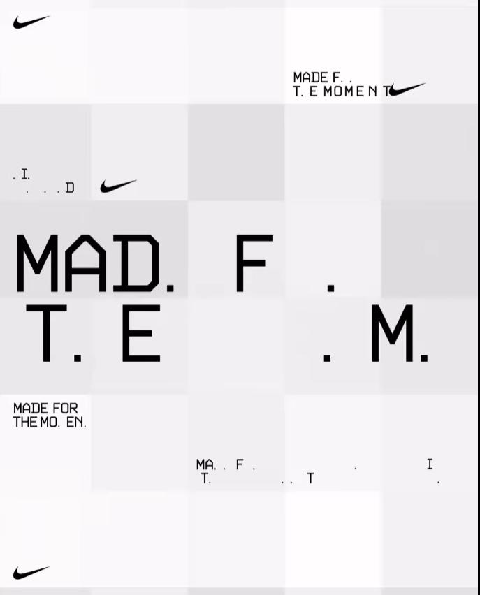
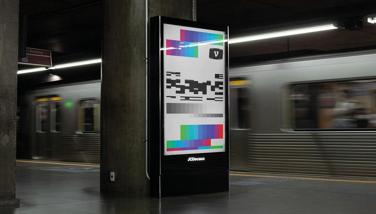
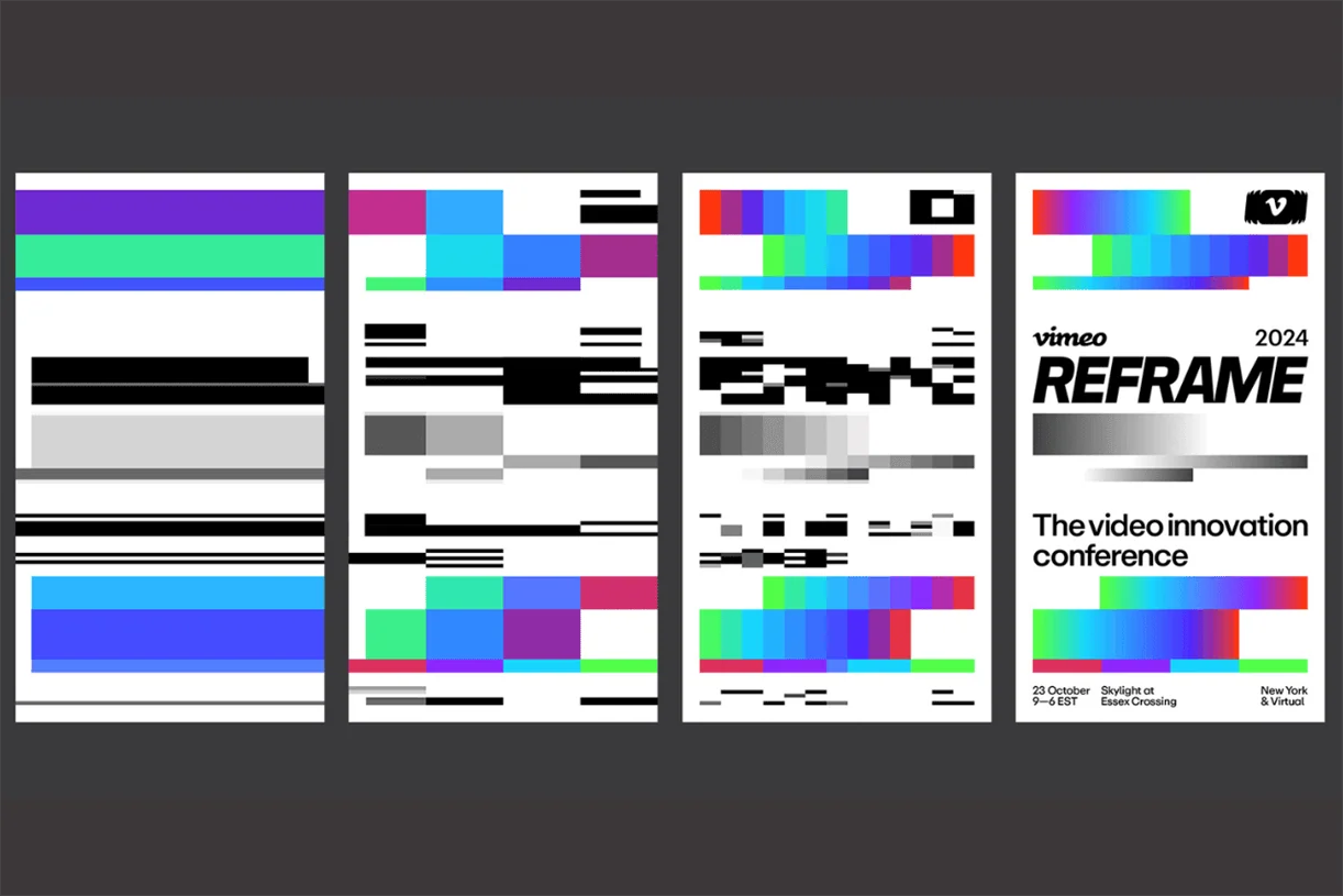
Amid the most polished styles in contemporary graphic design, a raw and deeply digital aesthetic is emerging.
This visual language draws from the early eras of computing, when pixels were inevitable rather than decorative. Monospaced typefaces, ASCII art, glitch graphics, bare interfaces, black backgrounds, hyper-visible grid structures, and error codes used as graphic elements are all part of its visual identity.
What was once a technical limitation is now an aesthetic choice, celebrating the technical, the structured, the robotic, as if the design were made by a machine.
It emerges partly as a reaction to the ultra-clean, fluid design that's everywhere. There's also a generational read: young designers reinterpreting the retro from a fresh angle, more aesthetic and experimental, without the emotional weight of nostalgia.
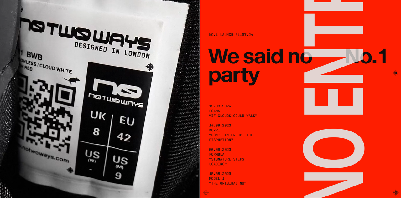

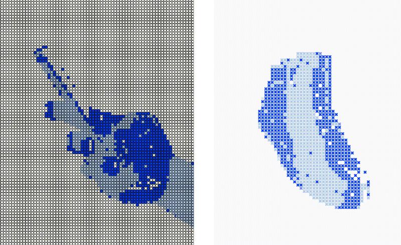

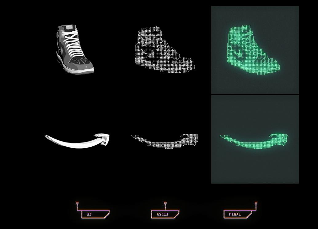
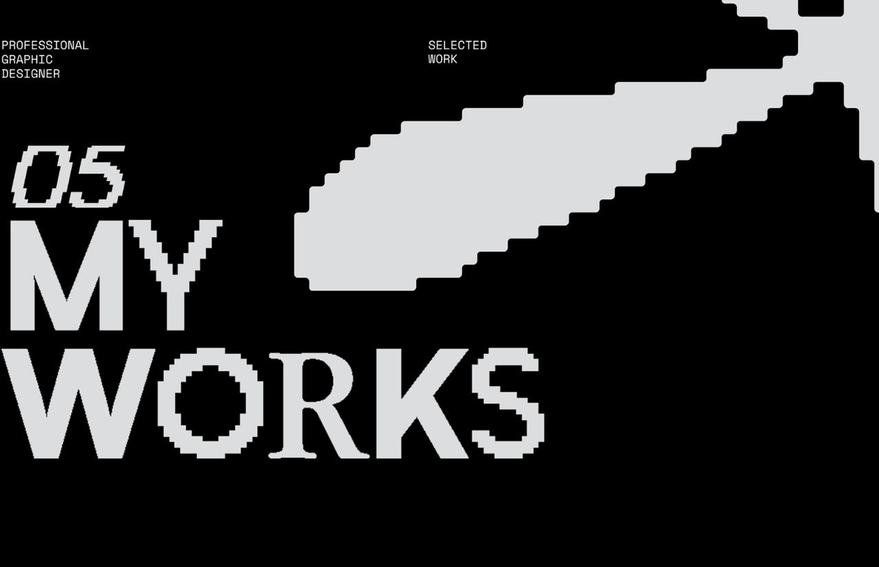


- Breaks away from the polished and predictable
- Speaks the language of the digital without a veneer
- Evokes nostalgia with a twist
- Connects with young, tech-savvy audiences through a strong visual identity
Don't Care
Graphics
These designers intentionally abandon traditional rules of legibility, visual order, and hierarchy, with a very deliberate attitude of provocation and standing out.
In a context where everything is optimized to be legible, functional, and aesthetically pleasing, this aesthetic rebels and proposes a different logic: one where visual overload, overlapping elements, chaotic typography, and apparent "bad design" become expressive tools.
What matters is breaking with the expected and capturing attention through visual noise and imperfection. From this, an ecosystem emerges where design intersects with the experimental, art, memes, and the rawest digital culture, and it works because in a sea of polished content, the unpolished stands out.


- Captures attention instantly through chaos and personality
- Connects with authenticity by rejecting corporate perfection and embracing the human
- Speaks the language of a generation that doesn't seek aspiration, but identification
Controlled
Caos
This aesthetic takes as its starting point the web of the 90s and 2000s, when pages were chaotic, saturated, filled with icons, overlapping text, loud backgrounds, and animations. These elements are brought into contemporary design as an expressive resource.
It's not about "being ugly for ugly's sake," but about challenging traditional aesthetic canons to create an authentic emotional connection, charged with nostalgia, irony, and controlled chaos.
This current rejects the flat, clean, and minimalist to celebrate the overloaded, the hybrid, the trashy, the poorly-rendered digital, what looks made without rules. Yet there are rules: just different ones. They come from the language of the internet, of memes, of forums, of amateur sites made with love but without professional guidance.


- Recovers an emotionally powerful aesthetic
- Reacts against homogeneous minimalism
- Creates closeness: it looks made "by real humans"
- Allows for irony and visual humor
- Highly relatable to young audiences
Text &
Blocks
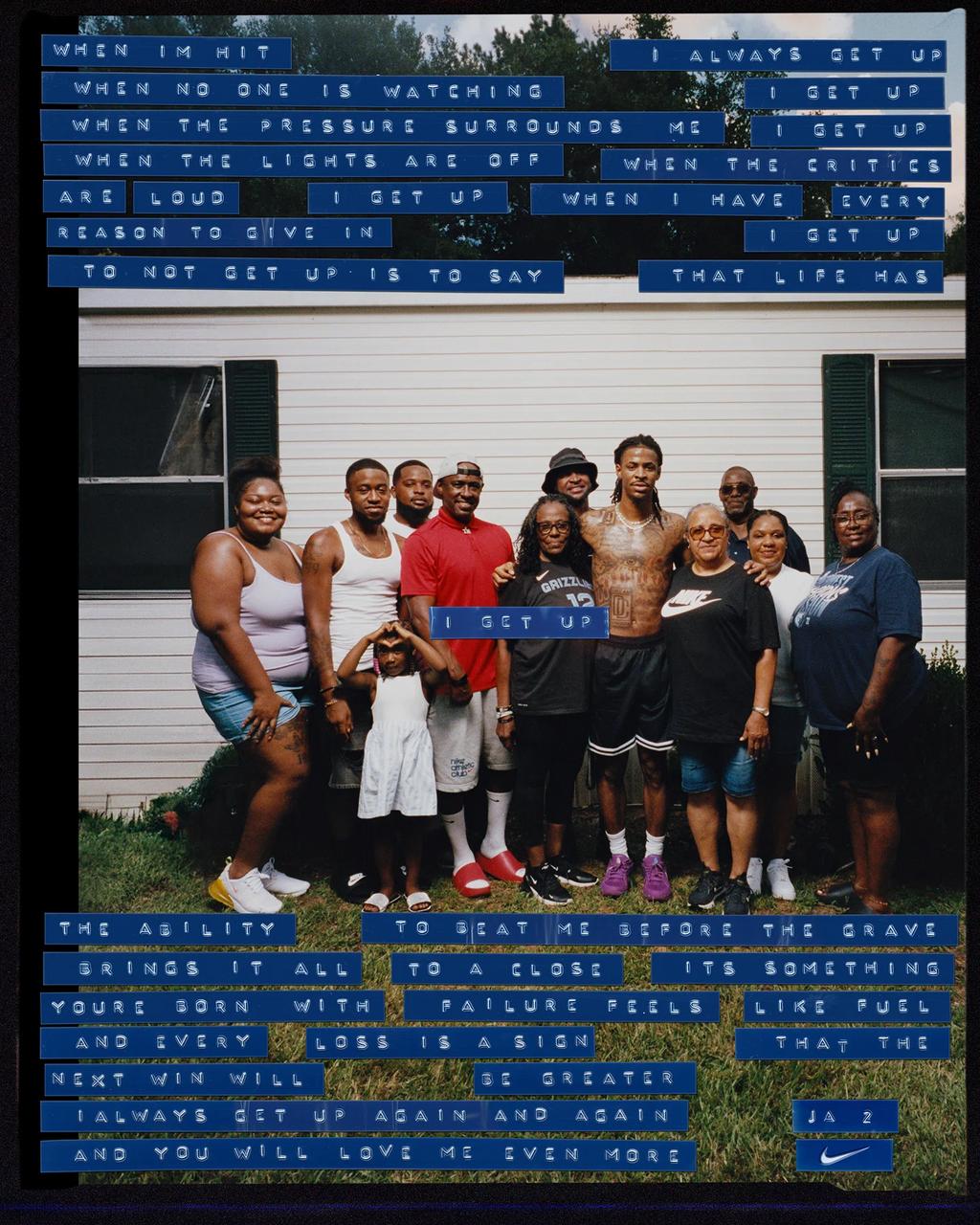
This visual current doesn't just put typography at the center of the composition. It uses it as an expressive material capable of carrying emotional, cultural, or narrative weight.
What sets it apart is the use of color blocks, rigid structures, or visual fragmentations that don't simply contain the text. They direct and isolate it in relation to its surroundings.
These blocks function as visual interruptions: marking pauses, generating rhythm, and establishing unconventional hierarchies. The text stops being purely informative and becomes a powerful visual presence that demands attention and redefines its meaning through form.


- Generates rhythm and pauses while communicating the message with force
- Plays with the contradiction between order and chaos
- Pursues a new aesthetic of protest or statement
What The
Font
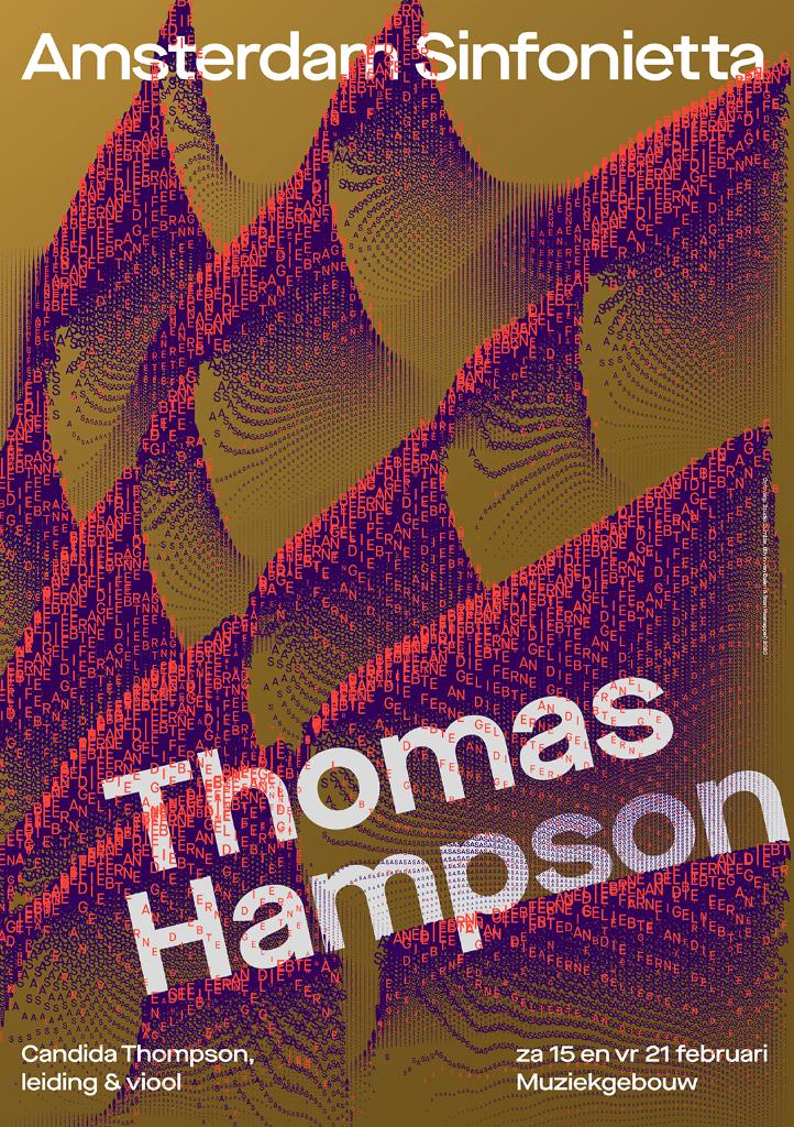
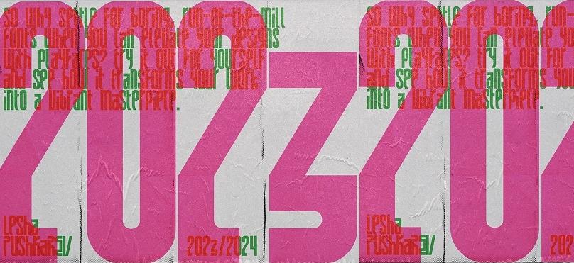
Here, typography stops being a transparent medium for communicating a message and becomes visual matter, texture, art. Letters deform, stack, fragment, or distort until they're nearly illegible, but that doesn't diminish them. If anything, it amplifies them.
This typographic approach creates a visual enigma that captivates: text transforms into a game, a rhythm, a texture where it's no longer about reading, or even deciphering, it's about exploring.
In many cases, the message itself stops being the point. What matters is how what you see makes you feel, how that typography vibrates within the composition. It's an aesthetic that celebrates visual noise, controlled chaos, and the cryptic as a form of expression.
Text functions as a work in itself, where what matters isn't so much what it says, but how it says it. A visual tension is created that invites you to keep looking, not necessarily to understand, but to feel.


- Shifts text from a purely informational role to a stronger visual protagonist
- Invites the viewer to experience text as art rather than information